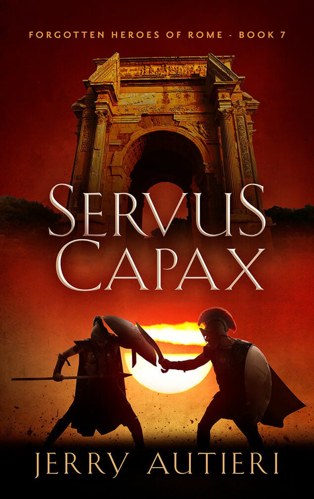
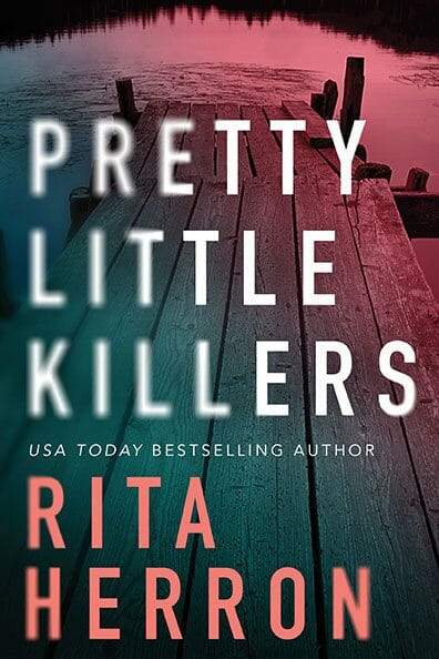
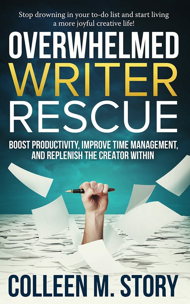
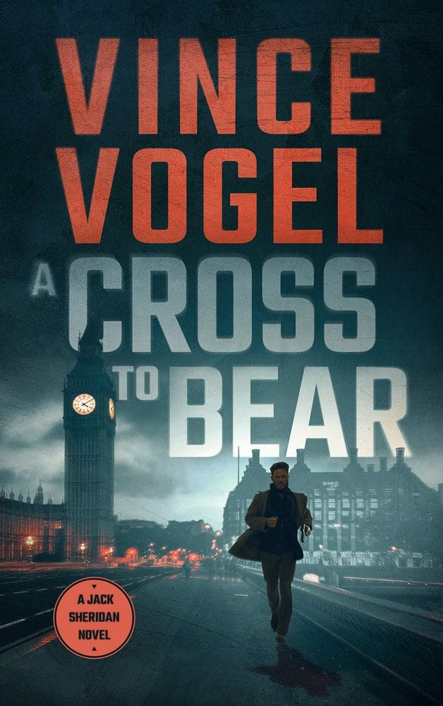
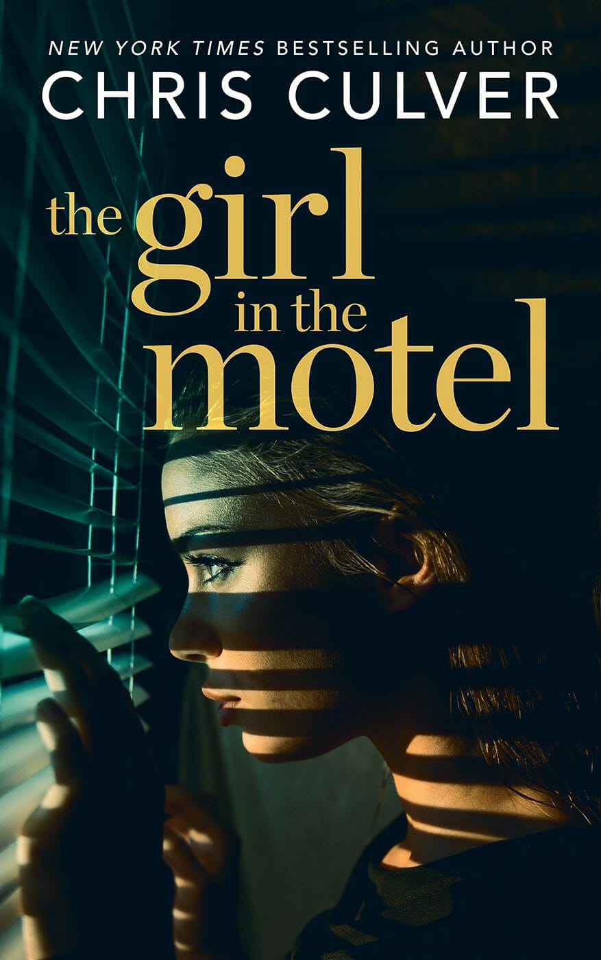
Your Readers Don’t Care if Your Book Cover Uses AI
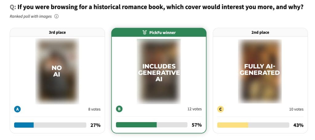
Unless you have personal, ethical objections to generative AI, don’t worrying about it being on your book cover. Amazon doesn’t penalize it and readers don’t care.
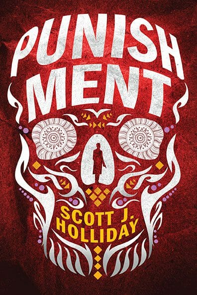
Don’t Be Different: The Common Book Cover Mistake Costing You Sales
The trouble is that with book covers, especially for new authors and new books, there’s no inherent emotion attached to the book yet. There’s no reason for a reader to be emotionally attached to a book they know nothing about and have never heard of.
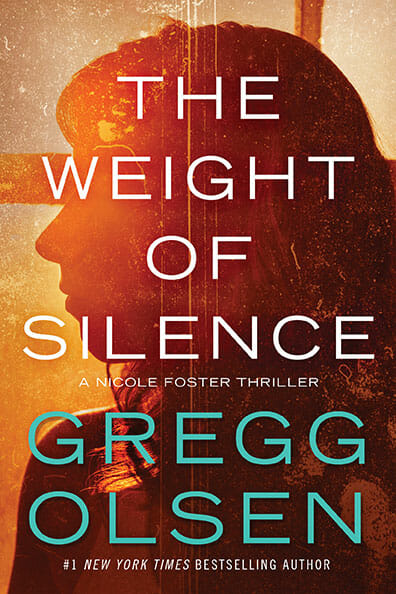
AI Book Covers in 2025: Your Indie Author Decision Guide

So, AI book covers. It feels like you can’t browse author forums or social media for five minutes without tripping over a discussion about them. Is Artificial Intelligence the secret weapon budget-conscious indie authors have been dreaming of, or is it mostly hype hiding a minefield of problems? If you’re feeling caught in the crossfire […]
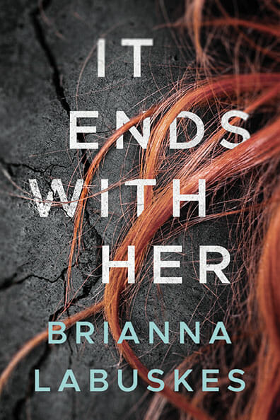
Yes, AI Can Design Your Book Cover—But Should It?
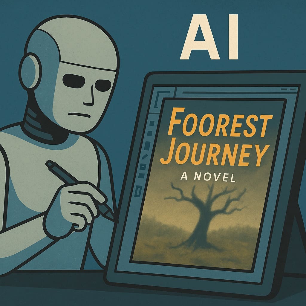
In 2025, it finally happened: AI can now design an entire book cover. Not just the artwork—the whole thing. Typography, layout, title placement… even matching it to your book description. You could, in theory, have ChatGPT or Midjourney generate a complete, print-ready design in seconds. But before you let your novel show up to the […]
The right way to use AI the right way as part of your book cover
Your book cover isn’t just a pretty face; it’s the charm, the swagger, the well-timed wink that convinces readers to take a closer look. It’s got one job: to stop potential readers in their tracks and whisper, “This book is worth your time.” But here’s the catch—a cover that tries too hard can be just […]
How to choose the best cover designer for your book
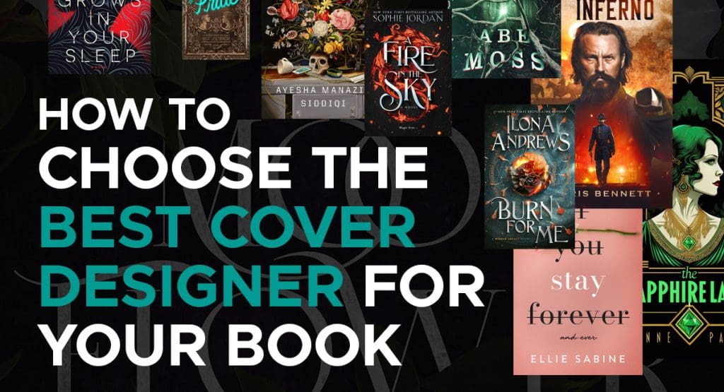
How do you tell the difference between a great book cover designer and a mediocre book cover designer?
The 5 Best Book Cover Designers for Self-Published Authors
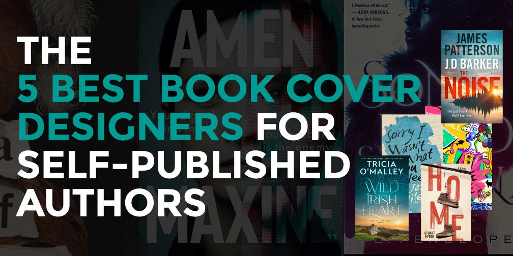
This is it. This is the definitive list. These are the best book cover designers for self-published authors.
9 Book Cover Design Trends for 2024
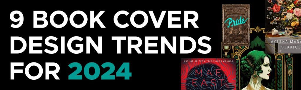
Wrapping your tome in a trending, eye-catching design can increase interest, readership and sales. It is therefore vital that you partner with a quality cover designer who understands these hot new trends, which in 2024 take the following forms.
Addressing Concerns: Understanding and Overcoming Hesitation About AI in Book Cover Design

As a book cover designer, I like to think I have a bond with other professional creatives, whether writers, designers, musicians or that guy who duct-tapes bananas to a wall and charges $120,000 for the soon-to-be overripe art. Perhaps we share less of a bond. Like second cousins. What binds creatives is the act of […]
Boosting Creativity: How AI Enhances Book Cover Design

Generative AI, on the other hand, is *fixable*. Because it lets us control what we create. If you want a South Asian sorcerer in a wheelchair with a pet hawk? We can do that now. Before AI, we would’ve had to approximate — or worse, whitewash the character with “close enough” stock imagery. This is […]