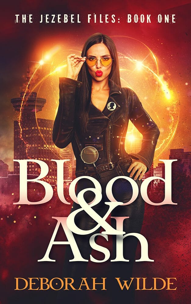
I can tell when a cover design brief was written by ChatGPT. Not from the grammar or phrasing, though they can be clues.
It’s the content. With a tone of total confidence, the brief will ask for odd things that just don’t go together.
AI cover design critiques are the same. An author sends over a list of changes suggested by AI, and it reads, unsurprisingly, like it came from someone who’s ingested a thousand articles about book covers, but never actually looked at one.
Books, for better or worse, are still judged by their covers. By relying on AI to guide your design, you can jeopardize its potential for success.
And to be clear, I’m not talking about obviously AI-generated covers. Those have their own problems. I’m talking about something much more subtle: a cover designed by a professional human, with AI sitting in the art director’s chair.
This isn’t an anti-AI article – we use AI at Damonza (a little later I’ll explain exactly where and how). This is instead an article about one specific thing that AI is bad at, why that weakness is almost impossible for authors to spot, and how it can seriously harm your book’s prospects.
A test you can try at home
Find the best selling book in your genre – the one whose cover you’d kill for – and ask ChatGPT what it thinks of it.
I did just that. I fed it the cover of Alice Feeney’s My Husband’s Wife, a New York Times bestseller, darling of #BookTok, proud owner of 470,000+ Goodreads ratings. This is a book wrapped in an unquestionably eye-catching and effective cover, crafted by an expert art department, that has ensured the words inside are read by millions.

“Here’s the description of a book,” I said, “and here’s its cover. Tell me what you think.”
The correct answer: “It’s great, it’s working, I’d leave it alone.”
The actual answer: 900 words of redesign notes.
Lose the starry lake, put a house behind the key, add a second silhouette inside the keyhole, add mist, swap the pink title for copper… “It needs to be extremely simple, though.” It used the phrase “at thumbnail size” once, and made a great point… but then made five recommendations that would make the thumbnail an absolute mess.
And in 900 words about a book cover, it never once mentioned a competing book.
A sample of the notes it gave me
“The cover is currently selling a somewhat different book from the one you’ve described.”
“Where I think it goes wrong is the background and overall mood.”
“Spyglass is supposedly an enchanting old house in a pretty seaside village, and yet the house is completely absent.”
“I’d want some visual element that makes the viewer think, ‘Something is wrong here.’”
“The huge pink title certainly has impact, but I don’t love the pink against the teal and copper.”
“The title also overwhelms the key somewhat.”
This output isn’t a glitch. It’s precisely how AI tools are designed to work.
AI just evaluates your cover. And only your cover.
Ask AI for a critique and it will critique: just your cover, on its own, at full resolution, against a white background, along with whatever description you give it. But that’s not how potential readers see your cover, because it’s not how it’s presented online or in-store.
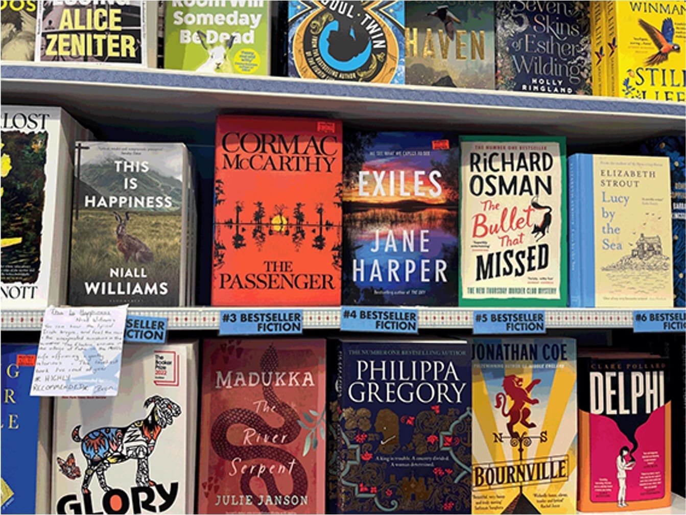
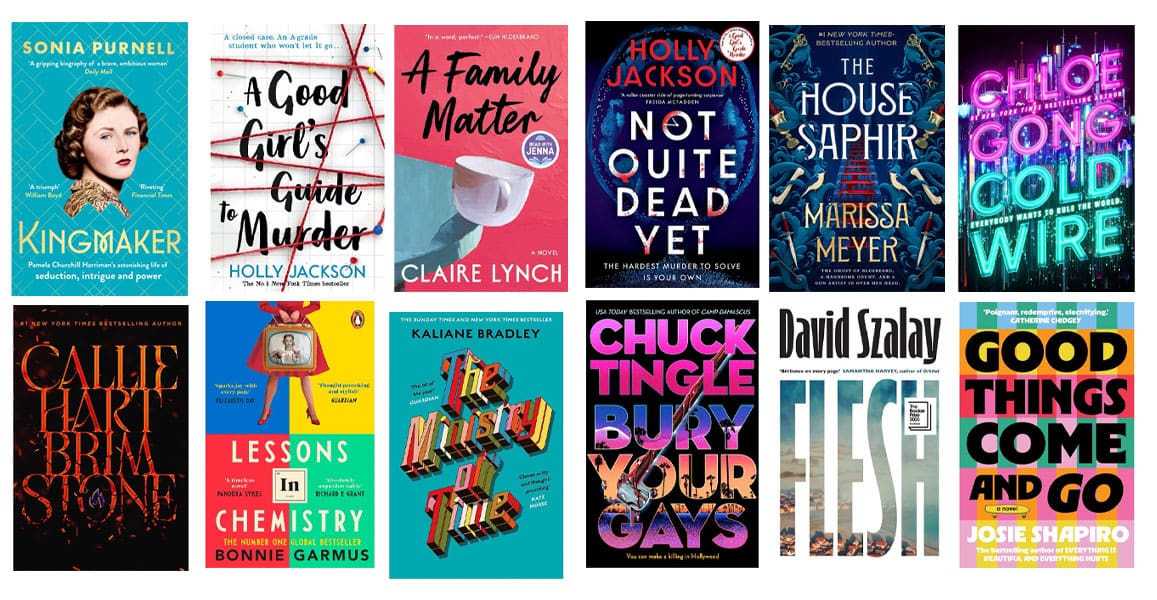
On Amazon your cover has about one second, and about 100 pixels of width, in a grid of twenty competing books, to stop a potential reader from scrolling past. And those readers aren’t judging your cover in isolation – they’re comparing it to all the other covers around it. The only question that matters is whether your cover beats the nineteen others on the screen.

AI never sees those other covers, so when you ask for a critique, it only gives you style notes based on inferred rules and weighted averages. It’s like getting technical advice from a Tai Chi instructor when you’re in a knife fight: the guidance might seem sensible on its own, but it’s useless in this contest.
“It’s like getting technical advice from a Tai Chi instructor when you’re in a knife fight.”
When you request a critique from AI, the book description you provide becomes the standard to which the cover is measured, because the description is all it has. For My Husband’s Wife it complained that Spyglass, the house, is missing from the cover, because it’s such a focal point of the book. That was the AI checking the cover against the plot, because it’s the only point of reference or yardstick it has. But no one buys a book because the cover is perfectly faithful to the narrative.
The opposite is true: the best covers are suggestive, implicit, slightly mysterious… and all the more enticing for it.
It applies rules that are true – on average
Book cover design has plenty of rules of thumb: keep it simple, have a clear focal point, use strong contrast, make the title large and easily legible, limit the number of fonts and colors, leave enough negative space, create a clear visual hierarchy, avoid clutter, and make sure the genre is immediately recognizable. It’s all perfectly sensible advice. But the best cover isn’t the one that follows the most rules. Some covers need a huge title, others barely need one at all. Some need a single dominant image, others work precisely because they’re busy. Some need plenty of negative space, others need to feel claustrophobic. The skill isn’t knowing the rules. It’s knowing which ones matter for this particular cover.
Each of those design choices affects the others, and each spends an amount of a finite resource, be it room, attention or tonal range. Working out which good ideas this particular cover can afford, and which have to go so the rest can work, is most of a designer’s job.
“The skill isn’t knowing the rules. It’s knowing which ones matter for this particular cover.”
AI doesn’t analyze those trade-offs, because it doesn’t truly analyze your cover. It’s reciting what tends to be true about covers. Stack all the good advice onto a single image and you get a raven, a locket, a burning map, a cathedral, all the symbolism in the world, and nothing but a gray smudge as the thumbnail.
Color is where you see this effect most clearly, because it’s an input that can be boiled down to pure numbers. If you have a light background with dark text, it’ll tell you to brighten the text. But on a light background, brighter = less visible.
“A gray background with yellow text? Why not red? Red is bold, urgent, dangerous…” All true facts about the color red. But pure red on mid-gray has a contrast ratio of about 1:1, which is to say zero contrast – the words will simply disappear.
Let’s return to My Husband’s Wife. For the title, ChatGPT wanted to change the pink to the same copper tone as the key – it said the pink felt too “glossy.” But that pink is the only pink on the cover, and it works because it’s bright and helps the title stand out against the water. If the key and the title were the same color, the title would be lost.
The suggestion removes the best thing about the title, on the basis of averages, norms, and misguided vibes.
It’ll never tell you the cover is finished
You asked for a critique, so the AI, ever the people pleaser, delivers a critique. That’s the response it’s been asked for, so it will find three things for you to change, regardless of whether there are three things that should be changed.
Ultimately the output carries no information either way. A cover that needs serious work and a cover that’ll fly off the shelves will get the same array of confident suggestions.
This is the issue that does the most damage, because it compounds. You take the three initial changes on board, but when you ask for a critique again, it finds three more. Round after round, with each note seeming reasonable in isolation, your tweaks take your cover further and further from where it needs to be.
“You don’t ever ask it to stop, so it doesn’t.”
Why you won’t catch it
So AI can be wrong – not exactly breaking news. When you know that AI can hallucinate, there are checks and balances to mitigate and navigate that. The problem, in the case of cover design, is that you probably won’t be able to tell when it’s wrong.
Cory Doctorow recently talked about this on Jon Stewart’s podcast. He’s a novelist, so his example might feel familiar:
“I’ve been telling copy editors and publishers’ lawyers that they’re wrong for 25 years. I’ve been telling spell checkers to go to hell for 40 years. I have collaborators who are institutionally using Microsoft Office 365, which has all this incredibly intrusive AI suggestion stuff built in. And I’m like, this is the worst advice I’ve ever seen. And if you don’t know what you’re doing and you take that advice, your writing’s going to suck.”
Cory Doctorow, on The Weekly Show with Jon Stewart
Every author reading this has overruled spellcheck: the software underlines a deliberate choice and tells you to fix it, and you ignore it without a second thought, because you know what you’re doing. You’ve formed a style, and you know that breaking arbitrary or needlessly strict grammar rules from time to time can make your prose better.
As a writer, you just don’t have that same instinct for design. So when software tells you the title needs more contrast, nothing in you says no. It’s confident, it’s specific, it uses all the right words, but it’s wrong.
As Doctorow puts it:
“Here’s one absolute rock solid truth about AI: unless you know your subject, AI is not going to be a consistent help for you in using it. You already have to be versed.”
Cory Doctorow
What AI direction can cost you
A design recommendation is impossible to judge when read as a text instruction. “Make the title brighter” sounds perfectly reasonable written down, and might only become obviously wrong once you look at the result.
Which means the only way to find out if the advice is bad is to action it. And because AI never tells you to stop, it’s rarely just one round.
There’s another problem with this cycle, though. As designers, we’re trying to make a cover that works, but we’re also trying to make a cover that you love. It’s your book. You’re the one who’s going to put it out into the world, promote it, talk about it, and hopefully still be looking at it proudly years from now.
But once you start feeding AI-generated direction back to your designer, you’re not really directing the cover anymore. AI is. The instructions just happen to be arriving through you.
And, increasingly, we can tell. AI-generated feedback has a particular flavor: lots of perfectly reasonable-sounding design language, very specific instructions, and changes that don’t necessarily make sense together. Often we’ll read a list of requested changes and know before we make them that they’re going to make the cover worse. But it’s your cover, and you’ve asked us to make them, so we do.
You get the new version back. Something doesn’t feel right, but you’re not sure why, so you show it to AI again. It finds more things to change. We make those changes. Still not right. Back to AI.
Before long, you’re several rounds into a cover that’s moving further and further away from the one you originally liked. You’ve spent days or weeks reviewing versions, requesting changes and waiting for new drafts. We’ve spent hours making changes that haven’t brought you any closer to a cover you love. And the worst part is that neither of us was really making those decisions. We were both following the advice of something with no stake whatsoever in the outcome.
“We were both following the advice of something with no stake whatsoever in the outcome.”
Bad advice about your writing costs you a few clicks of the undo button, maybe an afternoon for big edits. Bad advice about your cover can cost days or weeks of back-and-forth, a delayed launch, and ultimately a book that goes on sale looking worse than it did a month ago.
You only launch once, so the cover needs to work from day one. The only feedback that ultimately matters, how readers respond to it, comes when changes are at their most costly.
So place the most value on opinions that actually have something at stake. You have a stake because it’s your book. Your designer has one because their time, business and professional reputation depend on creating effective, high-quality covers. AI has neither.
When the book goes live and sales prove slow, you can’t go back to ChatGPT and ask what went wrong. Or you can, but you’ll get only a groveling “You’re exactly right, I got it wrong” in return.
What we might use AI for, and what we don’t
At Damonza we don’t use AI to design covers – not the concept, not the composition, not the finished artwork. Those are a designer’s most critical jobs, where all the key decisions live.
We instead use it narrowly, and only when it’s genuinely the right call. Sometimes an element is not possible to source through stock photo libraries: a texture, an effect, a building, a specific kind of person doing a specific kind of action, or parts of a scene so obscure and unusual that it isn’t possible to create with traditional composition methods.
If we use an AI tool, we tell you so, and we won’t use AI if you’d rather we didn’t. Some authors are relaxed about it, some aren’t, and both perspectives are fair – in the end it’s your book, so you get to choose.
The covers themselves are built the way they always have been: combining images, stock, illustration, effects, and type, and a designer making hundreds of tiny, seemingly inconsequential decisions about how these elements sit together, to build something greater than the sum of its parts.
We use our skills and experience to override AI. When a tool generates a bad element for us, we bin it, and we know exactly why. We don’t want to come across boastful, but we’ve put in the work, we’ve been doing this for 14 years, and we trust our expertise. It’s the same instinct you have about your words, pointed at a cover instead.
The same applies to you. Use AI where you have the expertise to judge its answers. Talk through your narrative with it. Use it to tease out themes, interrogate your characters, organize your thoughts, or sharpen up the description you’ll send to your cover designer. You know your book. You’ll know when its suggestions are useful, when they miss the point, and when to ignore them completely.
Cover designers know covers. Give your designer the freedom to decide how to present your book, with your feedback to get it just right for you.
But don’t let AI be your cover art director.