Every year I write one of these, and every year the same thing happens. People look for predictions. What’s coming next. What’s new.
But book cover design doesn’t really work that way.
If you look back at my previous trend articles for 2023, 2024, and 2025, you’ll see a pattern. Trends don’t appear overnight. They intensify. Pressure gets applied. The market rewards what survives, and quietly kills off what doesn’t.
2026 is not a reinvention year. In many ways it’s a refinement year. Everything that already worked is being pushed harder because the marketplace is louder, discovery windows are shorter, and attention is more fragmented than ever.
One thing that hasn’t changed, and won’t change in 2026, is the importance of genre signalling. More important than any individual trend is whether a cover looks like it belongs in its genre. Readers don’t approach covers with an open mind. They approach them with expectations. If those expectations aren’t met in the first second or two, the book is skipped, no matter how current or stylish the design might be.
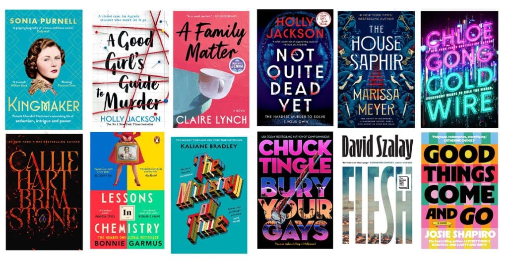
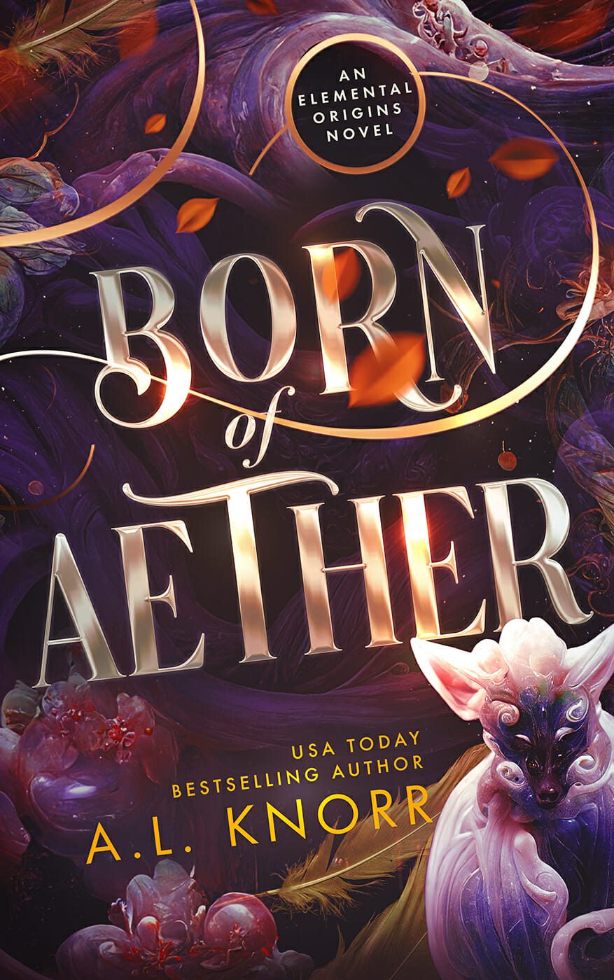
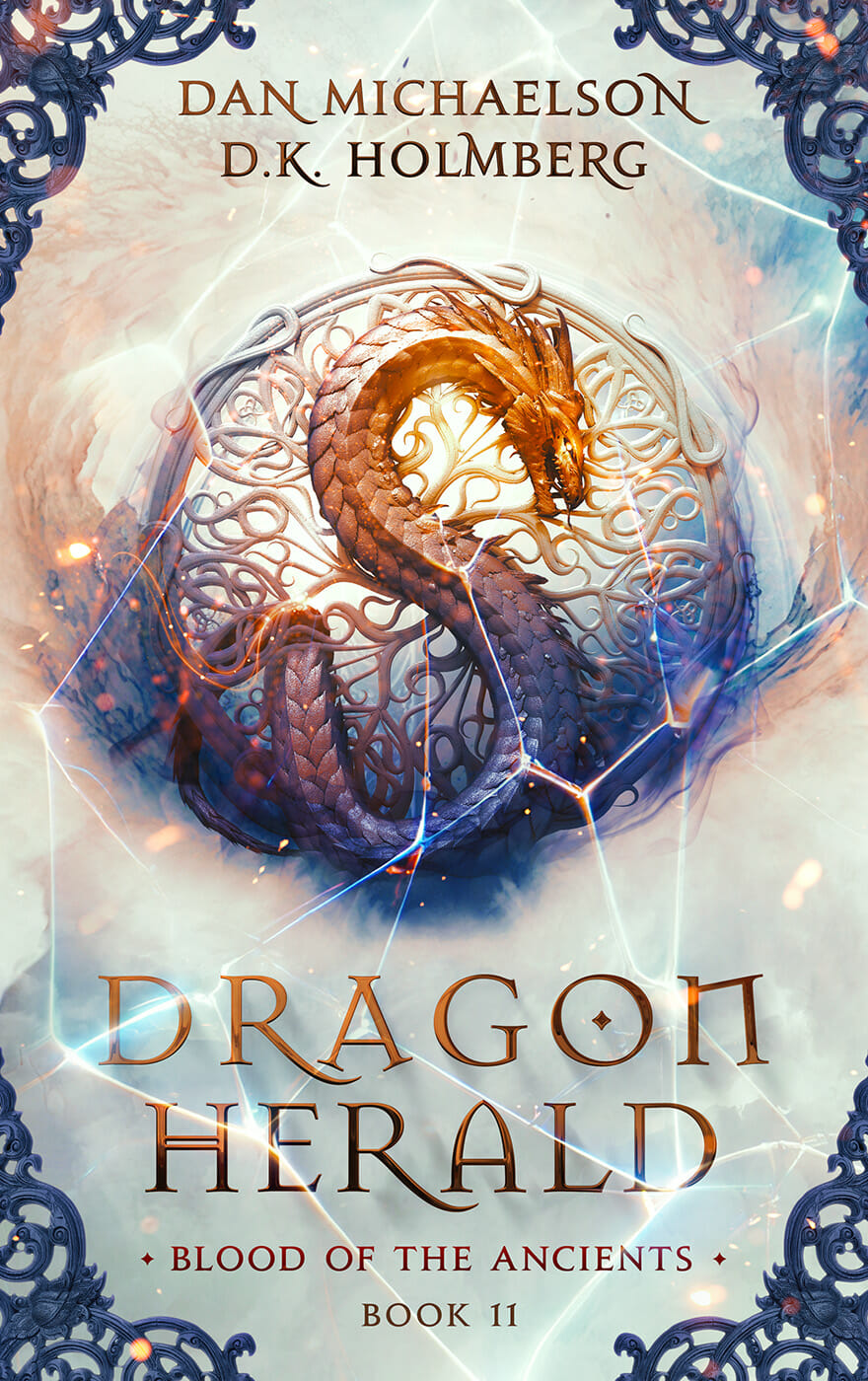
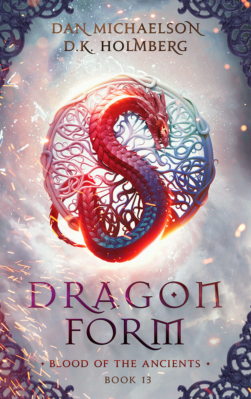
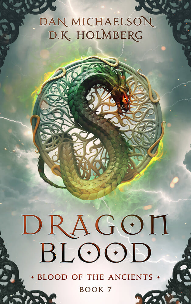
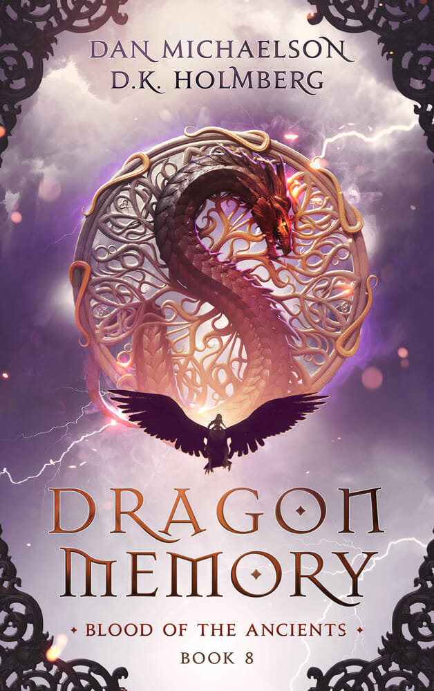
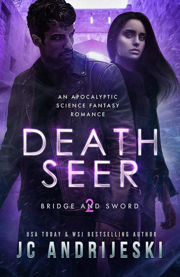
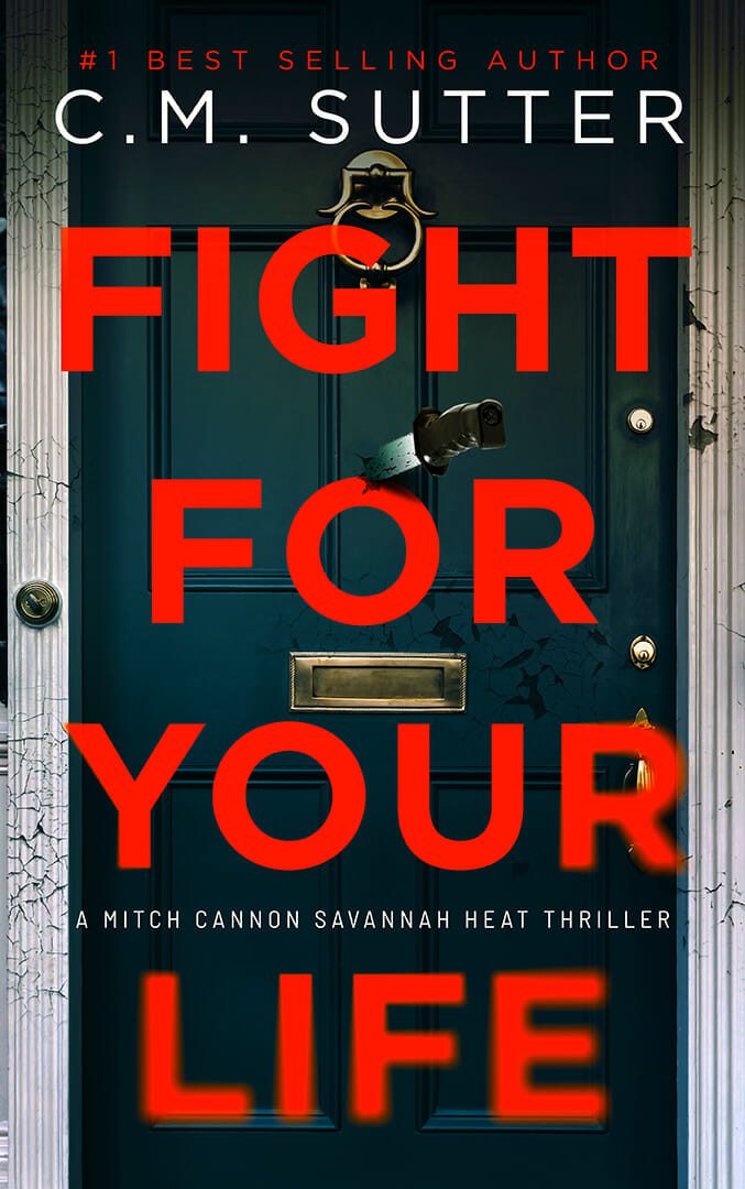
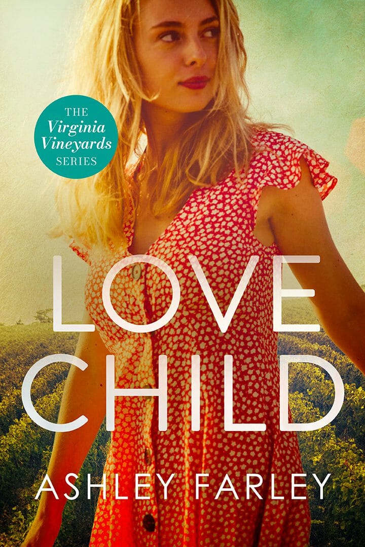
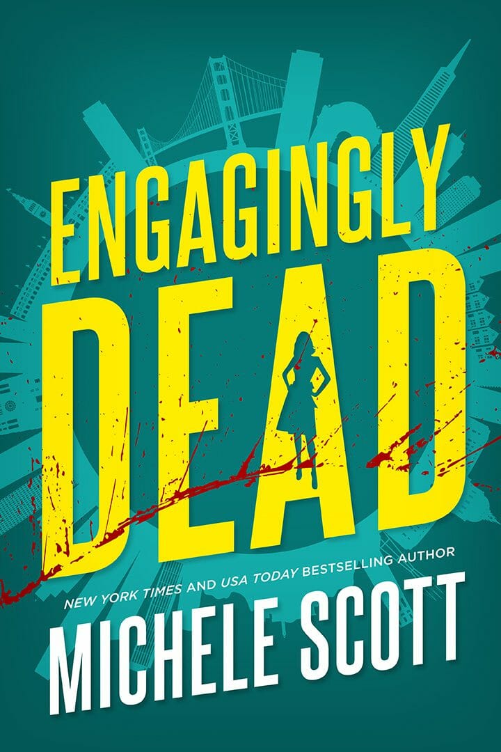
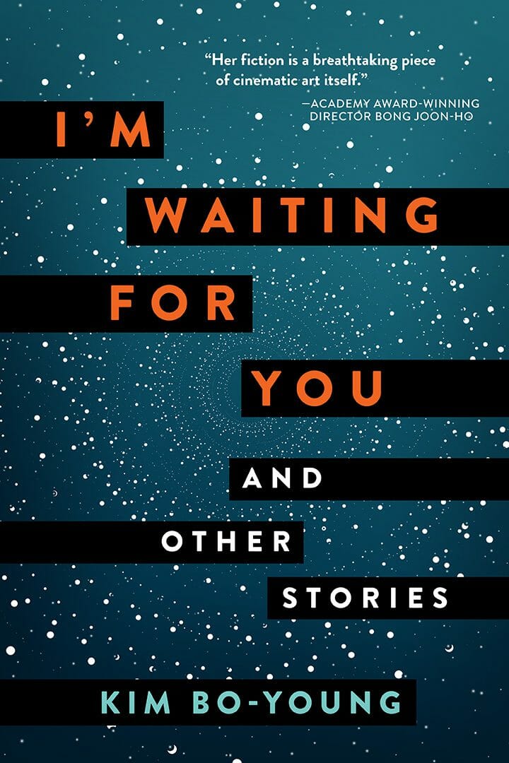
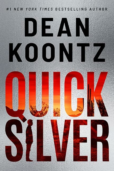
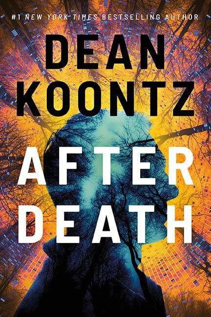
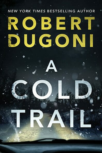
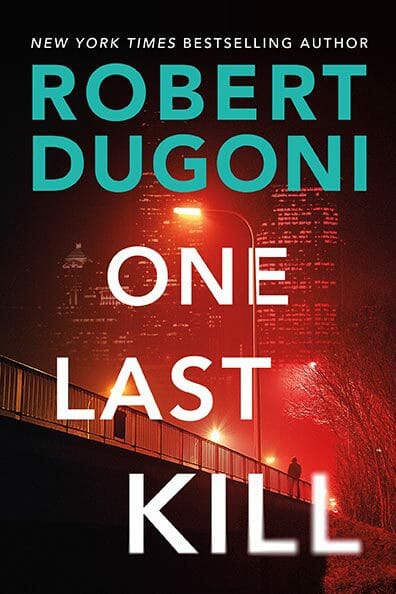
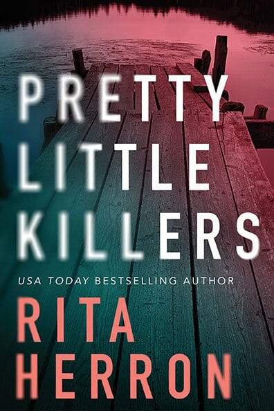
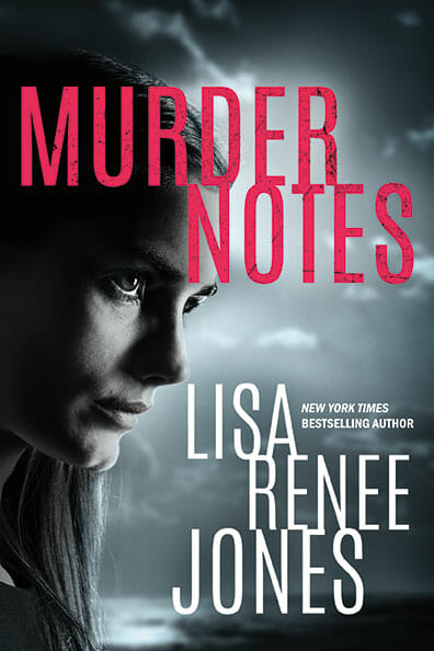
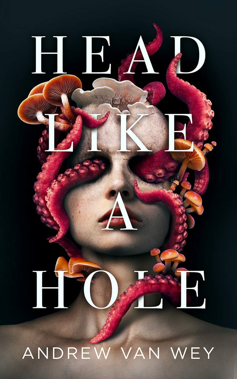
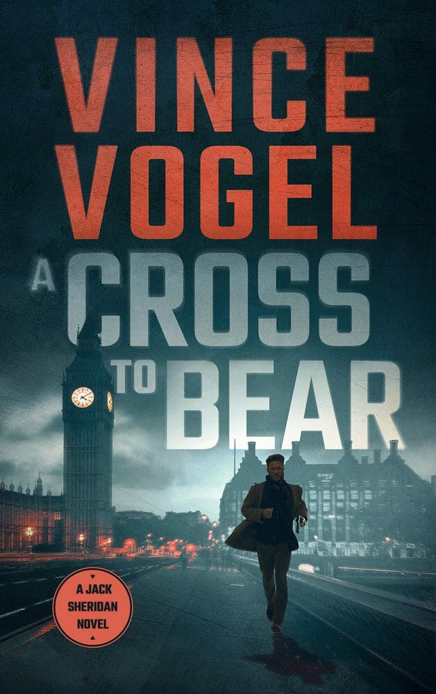
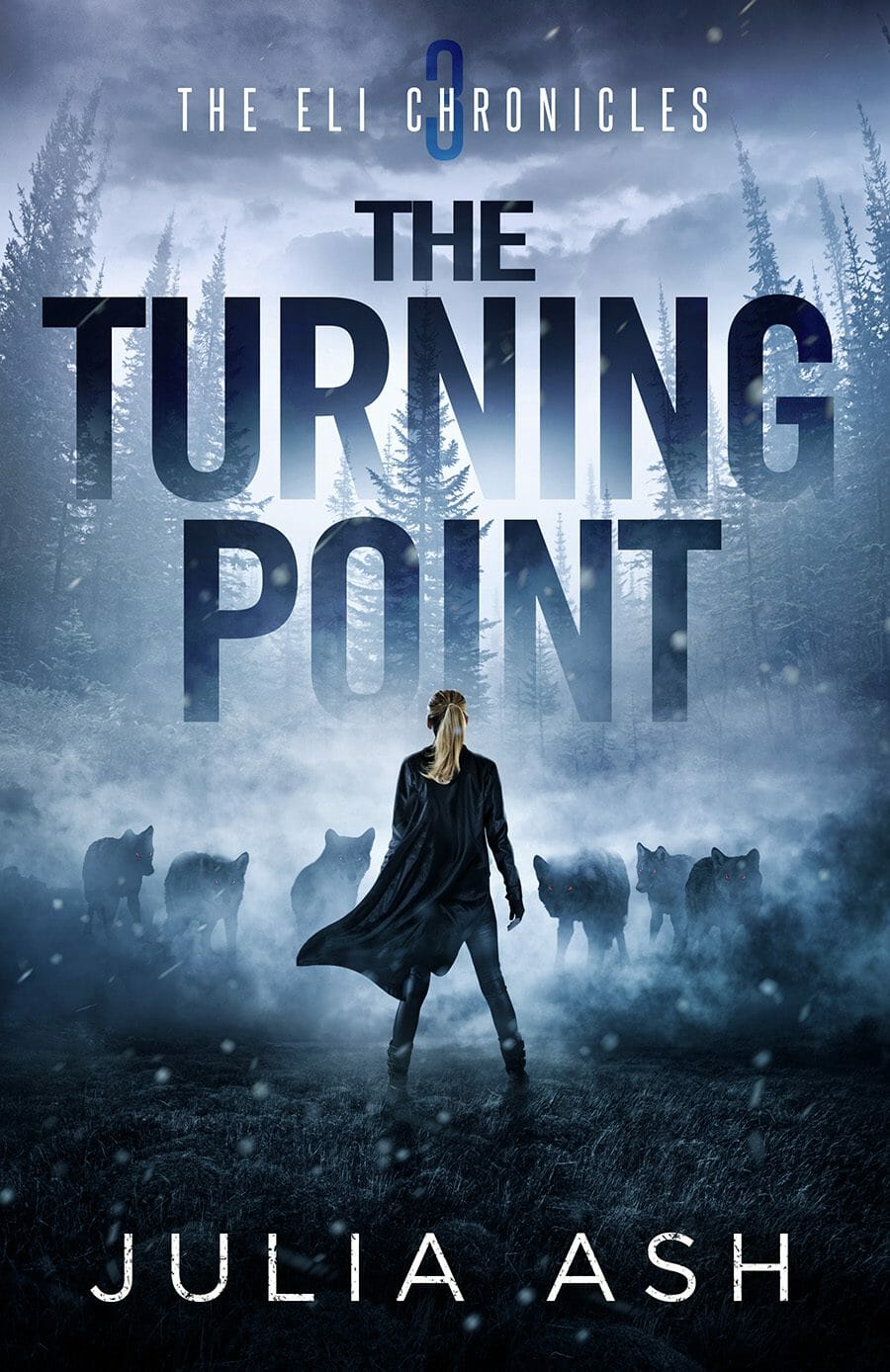
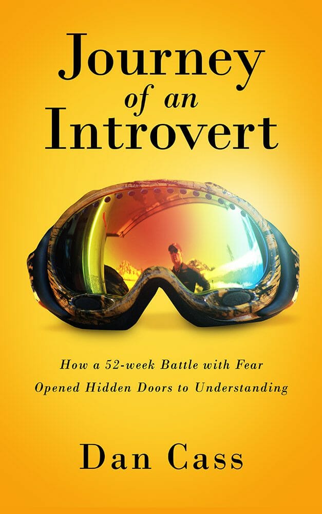
1. Typography As the Structure, Not the Decoration


Typography didn’t suddenly become important in 2026. It’s been gaining ground for years. It’s been one of the clearest separators between good covers and great ones. What’s changed is how dominant it’s become.
Titles now regularly occupy most of the cover. Sometimes 70 or 80 percent. Sometimes more. Imagery, if it exists at all, often functions as texture, framing, or atmosphere rather than narrative illustration.
This is not a stylistic preference. It’s a direct response to how books are discovered. Most readers first encounter your cover as a thumbnail on a phone. At that size, nuance dies instantly. If the title doesn’t read immediately, the cover fails before the reader even knows it exists.
Typography solves that problem better than anything else. Big, confident type can communicate genre, tone, and professionalism in a fraction of a second. It also scales cleanly from thumbnail to print without falling apart.
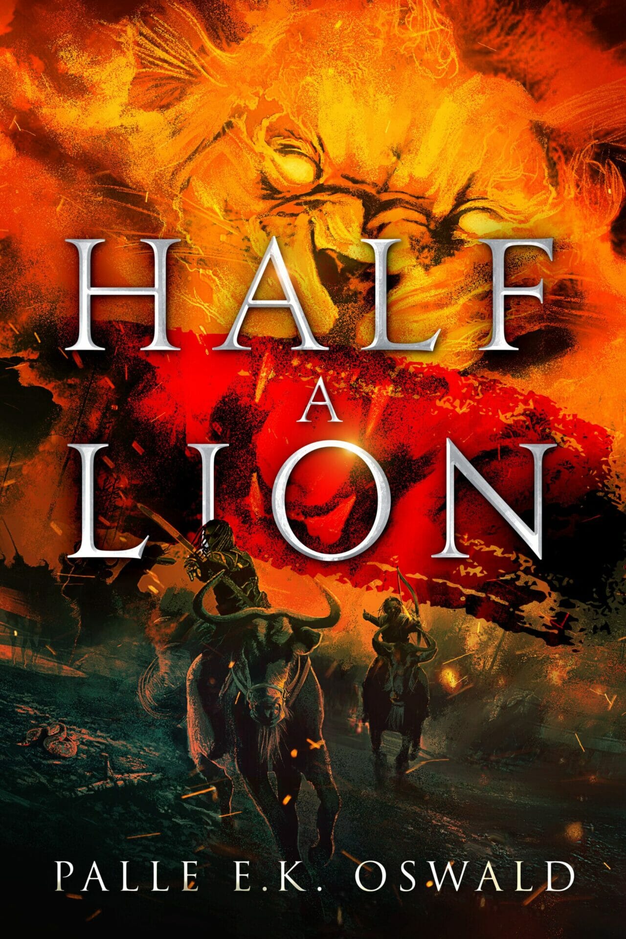
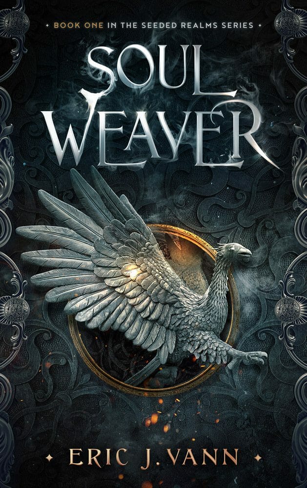
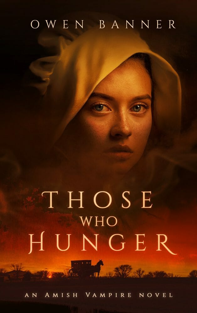
Across genres, this shows up differently. Literary fiction leans toward oversized, confident sans serif or clean serif type. Thrillers push bold condensed fonts, often elevating the author name into a brand signal. Fantasy embraces ornate display type, but at a scale large enough to function as artwork.
The uncomfortable truth is this. When a cover is seen at speed, typography is often the only element that reliably survives. If your title depends on subtle letterforms, delicate contrast, or clever typographic details to be understood, most readers will never register them. At thumbnail size, clarity beats cleverness every time.
Quick Tip for New Authors: Don’t make your name too small. Just because you’re new doesn’t mean your author brand isn’t important. You’ve heard the phrases, “Dress for the job you want” or “Fake it till you make it”. The same applies to your author brand. It should be loud and proud. You want readers to know who you are, or have them see your author name and at least have them question why they haven’t heard of you yet. It sends a subconscious signal that you already are an established author and this is a book worth reading by an author worth knowing about.
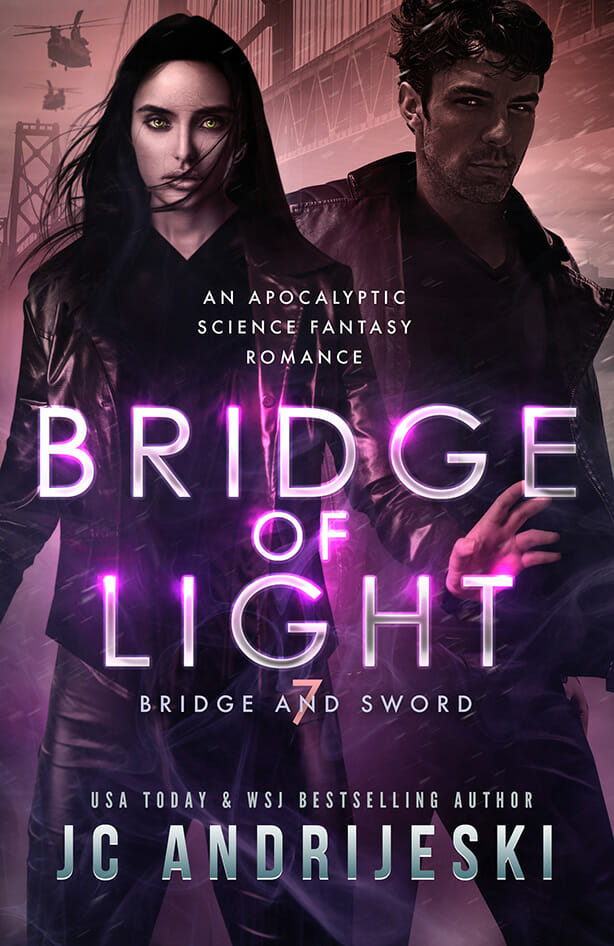
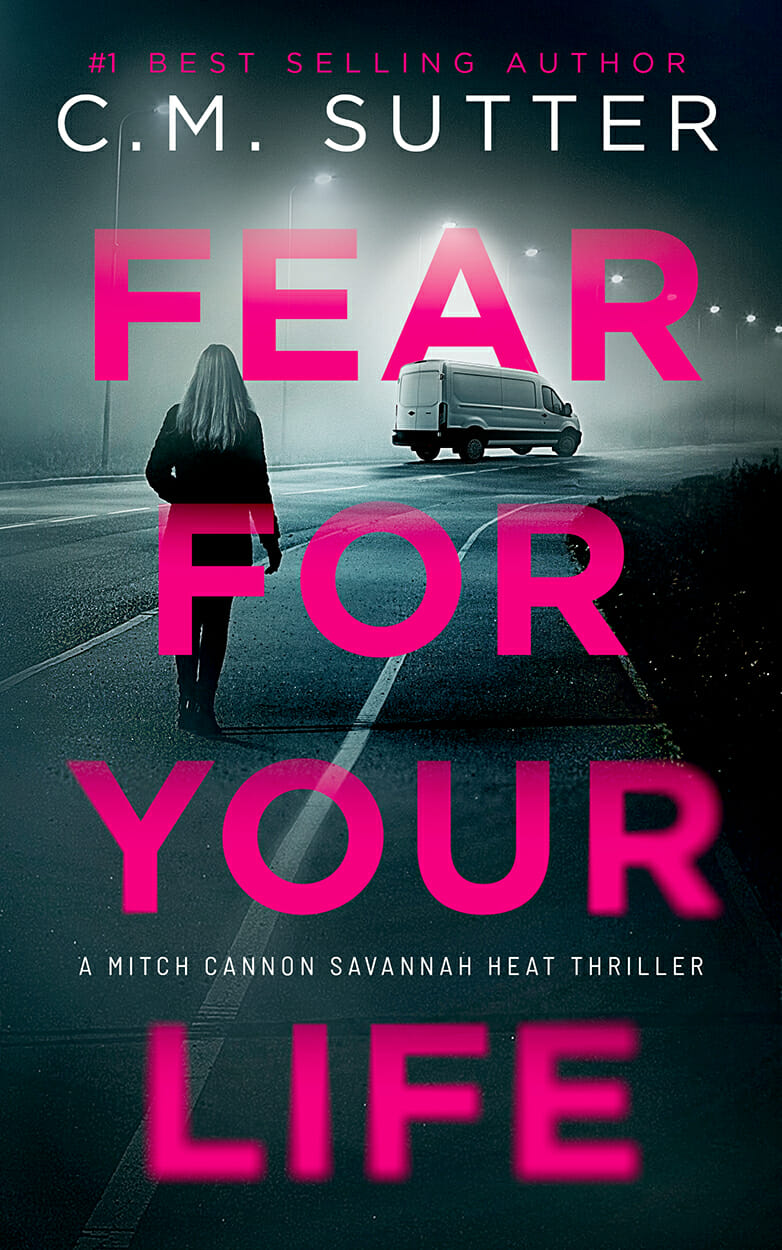
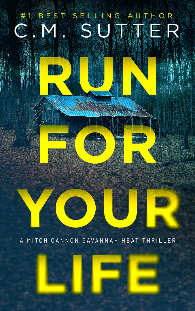
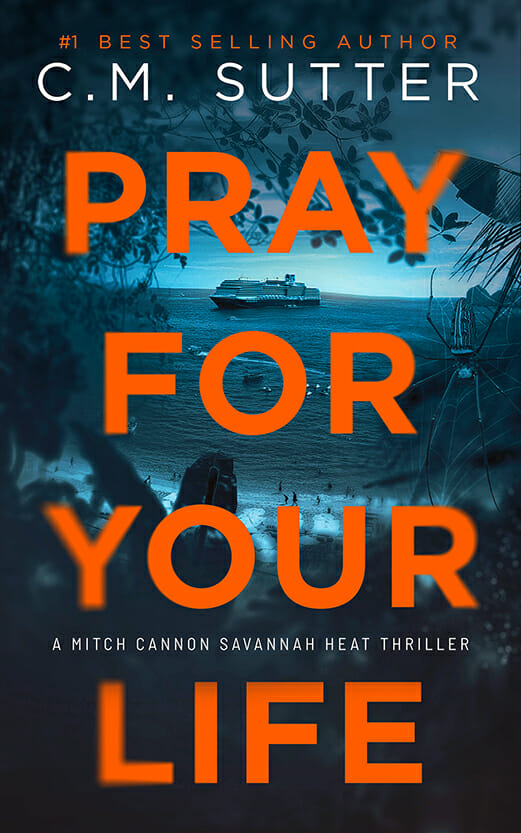
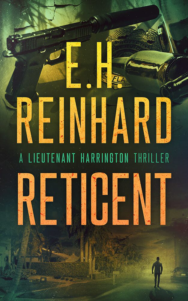
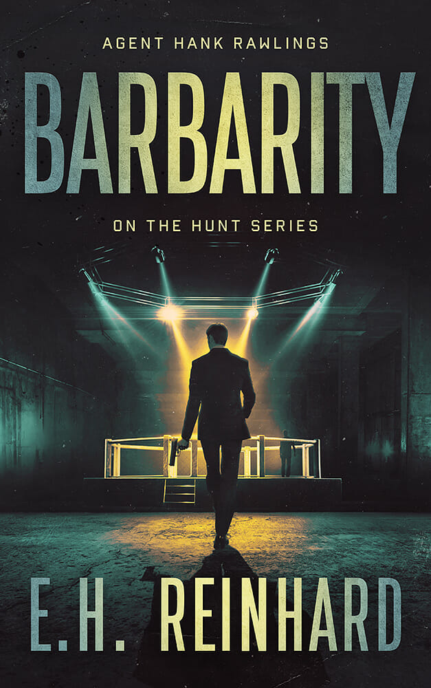
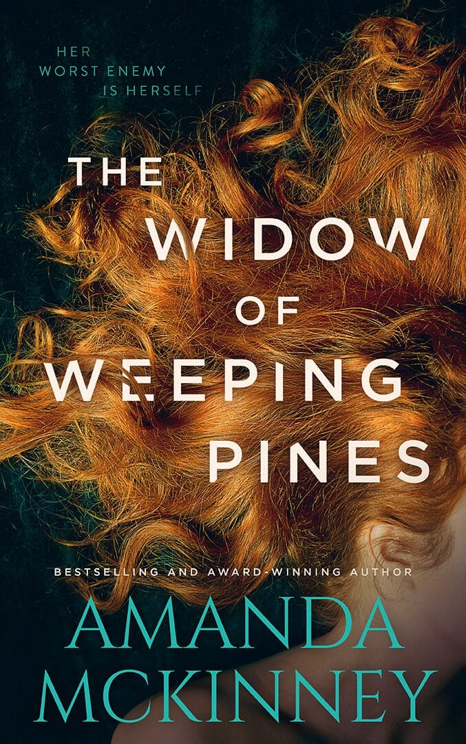
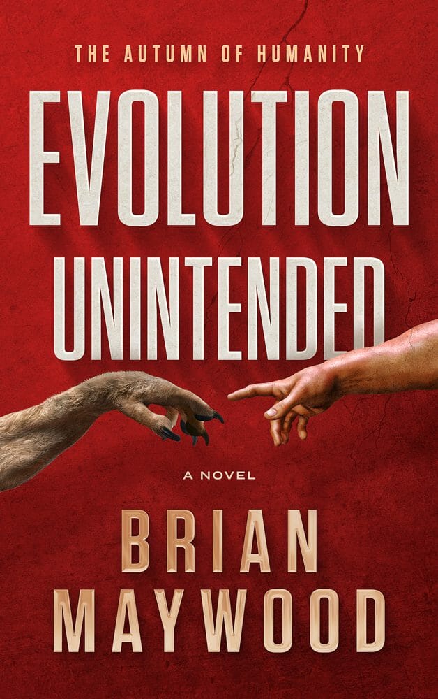
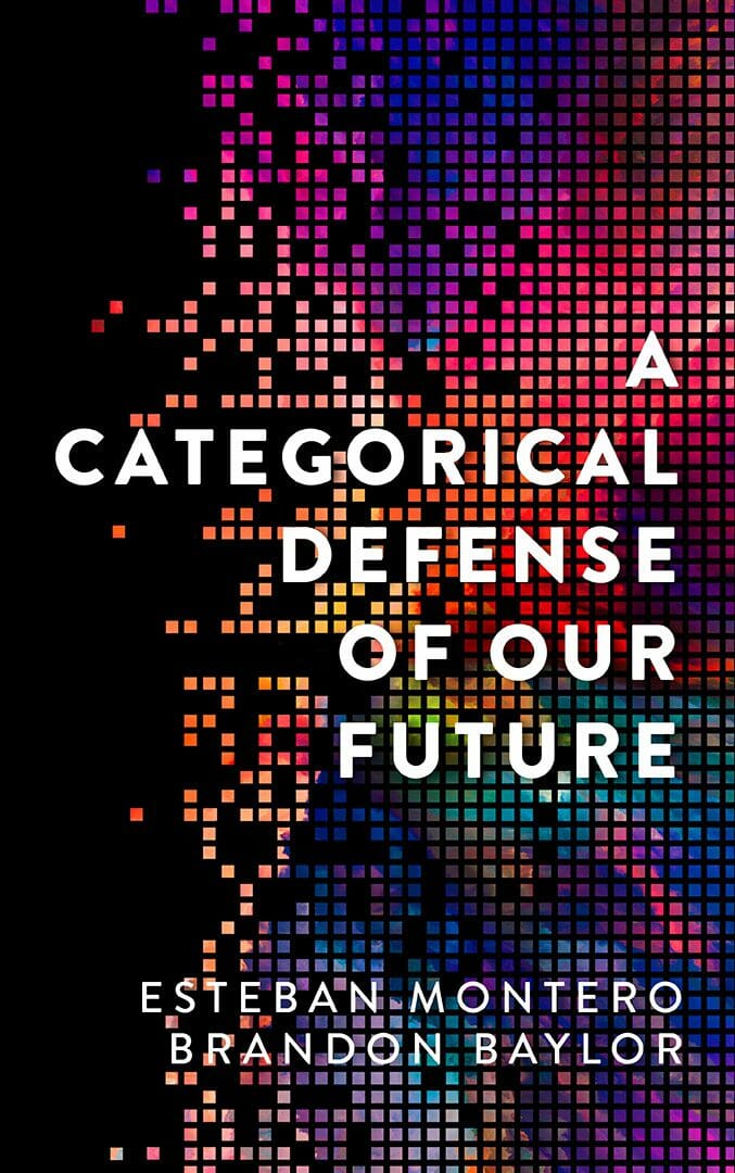
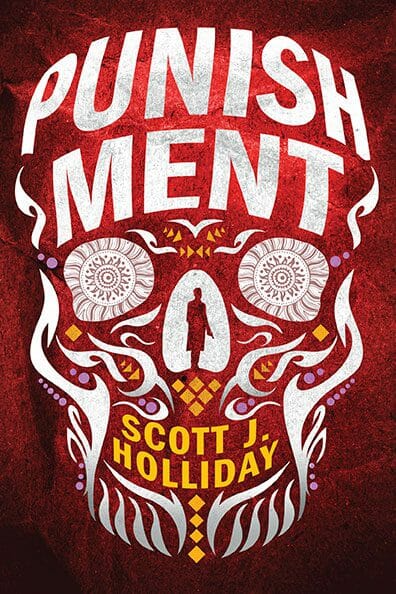
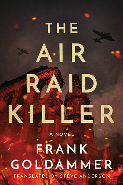
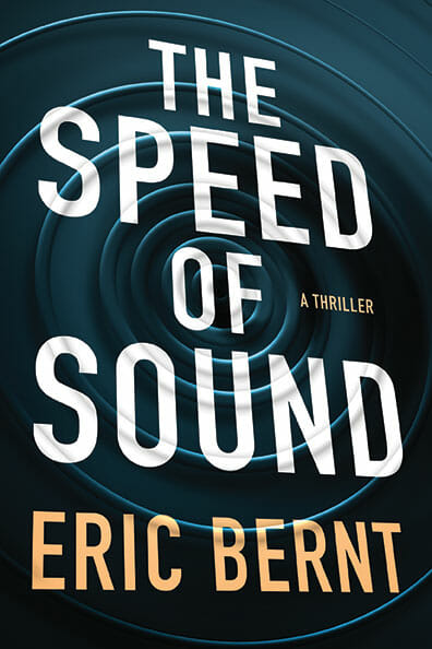
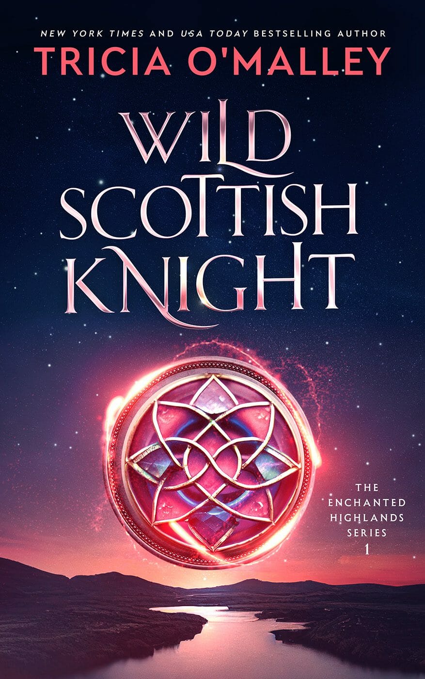
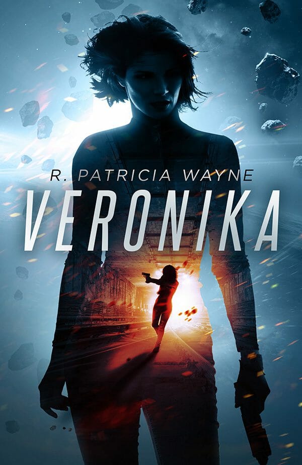
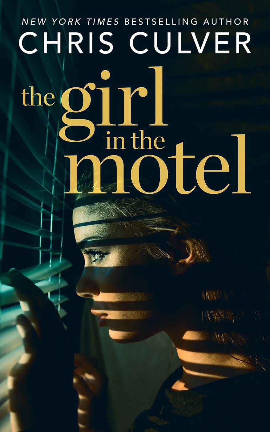
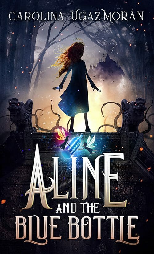
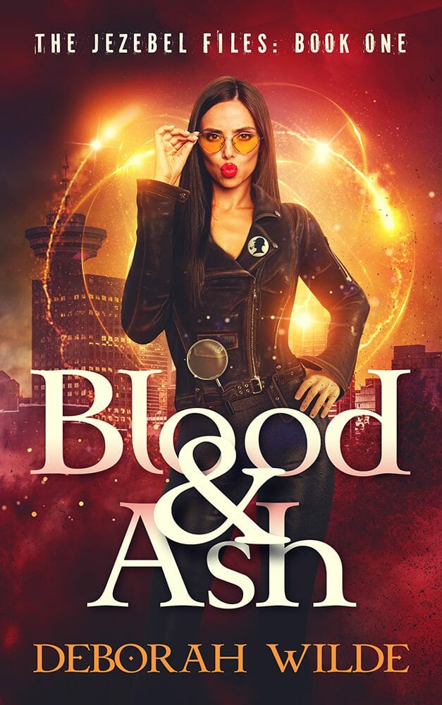
2. Contrast Over Subtlety: Color Is Doing Heavier Lifting


Bright covers are not new. What’s new is how deliberately contrast is being used to force clarity.
Romance proved years ago that saturated color sells. In 2026, that lesson has spread everywhere. Fantasy, thrillers, and even darker genres now rely on strong color contrast to define hierarchy and focal points.
This doesn’t mean everything is neon. It means flat, low-contrast covers struggle to survive.
Dark covers still dominate certain genres, but they’re no longer allowed to be visually vague. Jewel tones, sharp highlights, and bold accent colors cut through shadow and give the eye somewhere to land.
The same logic shows up in non-fiction as well, though often more restrained. Even there, contrast is doing more of the heavy lifting than it used to, especially at thumbnail size.
What matters is not brightness for its own sake. It’s legibility under pressure.
High contrast communicates emotion faster than imagery. It survives thumbnail compression. It performs better in ads. And it photographs well for social platforms, whether that’s Instagram, TikTok, or whatever replaces them next.
This isn’t a new trend. It’s the volume knob being turned up on something the market already decided worked.
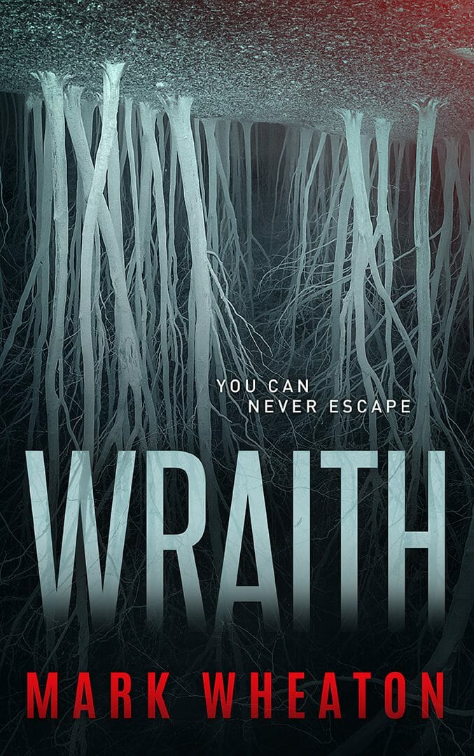
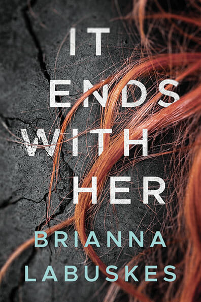
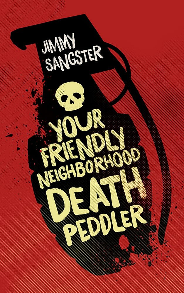
3. White


One genuinely newer development in fiction covers is the confident use of literal white backgrounds.
Not pale. Not mostly light.
Actual white.
White works because it removes visual noise and forces focus. It turns typography or a single graphic element into the entire message. On a crowded Amazon results page filled with dark thumbnails, white stands out immediately. This approach signals confidence. It feels editorial. Controlled. Intentional.
Crucially, white does not contradict the rise of bold color. It amplifies it. One strong element against white hits harder than multiple elements competing for attention.
These covers are not minimal because they lack ideas. They are minimal because the idea is strong enough to stand alone.
4. Covers Built for Two Sizes, Not One


Dual-scale thinking is no longer optional.
Every cover has to do two jobs. It must stop the scroll at thumbnail size and still reward someone holding the physical book. Designing for only one of those contexts is a losing strategy.
The most effective covers separate structure from detail.
Structure comes first. Big shapes. Clear hierarchy. Strong contrast. This is what wins the click. Detail comes second. Texture, grain, embossing, foil, subtle illustration, or tactile finishes that only reveal themselves up close.
This is why some covers look deceptively simple online but feel far more considered in print. That’s not an accident. It’s deliberate restraint.
If your cover only works large, most readers will never see it. If it only works small, physical buyers will pass. The covers winning in 2026 are designed to succeed at both without compromise.
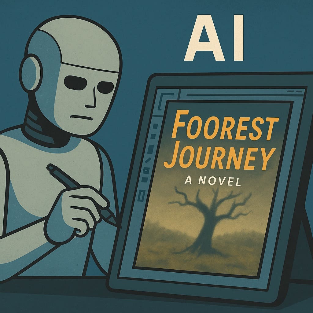
5. AI Is Everywhere, for better or worse


Important: Unlike the other covers presented in this article, which are selected to show good examples of a particular trend, these are just representative examples that I found on a website that allows authors to generate AI covers. This is not an endorsement or a criticism.
AI is now firmly part of the book cover design landscape. That fact alone makes it a trend, whether the results are good or not.
AI can generate covers quickly, cheaply, and at scale. Because of that, you will see more AI-generated covers in 2026 than ever before. Many of them will be confusing. Many will be generic. Some will be actively damaging to the books they’re attached to. Not because AI is broken, but because it doesn’t understand what makes a cover successful.
When AI is asked to design a cover, it tries to include everything. Characters. Settings. Plot points. Symbolism. Mood. Backstory. It attempts to summarise the book visually, which is the exact opposite of what a cover should do.
Covers are not summaries. They are signals.
AI does not understand hierarchy, restraint, or what the reader needs to know first. It doesn’t know what to leave out. It often focuses on literal scenes or characters when the cover should be communicating tone, stakes, or emotional promise.
The same issue appears when AI is used to generate cover briefs. The output is often contradictory or nonsensical. Dark but uplifting. Minimal but detailed. Epic but intimate. It sounds plausible until you try to design from it.
And yet, AI is not going away.
Used correctly, it can be a powerful component tool. It can generate specific visual elements that don’t exist in stock libraries. It can help explore variations once a core concept is already clear. It can speed up parts of the process without replacing judgement.
Ultimately, readers shouldn’t be thinking about how a cover was made at all, whether it involved artificial intelligence, stock photography, illustration, or hand-painted art. The moment a reader starts noticing the process instead of the book, something has gone wrong. The only reaction that matters is instinctive and immediate: “That looks like a book I might enjoy.” When the method becomes visible, the cover has failed to do its job. And that’s why the most effective covers won’t be driven by AI alone. They’ll be driven by human judgement, with AI used quietly and intentionally where it genuinely helps.
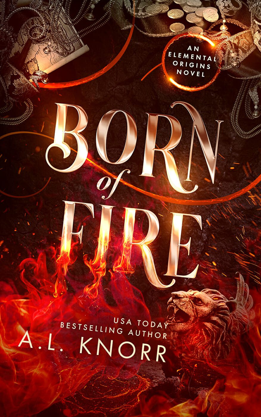
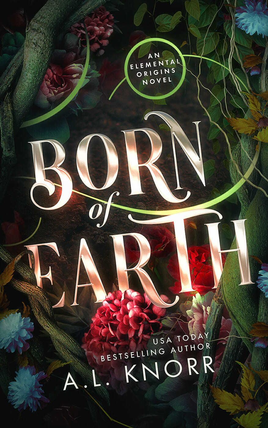
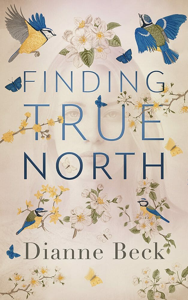
6. Art Over Photography: A Push Back Against Synthetic Perfection


Alongside the rise of AI, we’re seeing a quiet but deliberate shift away from hyper-polished photographic realism in many genres. More covers now feel made, not rendered. This doesn’t just mean flat, cartoony illustration. It includes painterly styles, textured digital painting, collage, hand-drawn elements, and artwork that embraces imperfection rather than hiding it.
This is not a rejection of digital tools, or even AI-assisted workflows. It’s a rejection of aesthetics that feel synthetic, too perfect, or emotionally closed.
AI-generated imagery often aims for photographic plausibility and visual completeness. Traditional art styles, whether created physically or digitally, tend to do the opposite. They suggest rather than explain. They leave space. They trust the reader.
Painted or illustrated figures feel symbolic rather than literal. They avoid the “that’s not how I imagined them” problem. They communicate mood and theme without locking the reader into a specific interpretation.
Importantly, many of these covers are still created digitally, with or without the use of AI. The distinction is not analogue versus digital. It’s crafted versus generic. In a market increasingly saturated with AI-generated covers, artwork that feels human, intentional, and authored has become a signal in itself, not because readers are thinking about process, but because it cuts through sameness.
What This All Adds Up To in 2026
None of these trends are really about fashion. They’re about speed. A book cover does not explain. It does not persuade. It does not tell the reader why they should care.
A great cover gets the click. That’s it.
The reader sees it and, within a second or two, thinks that looks like a book I might enjoy. Not after analysing it. Not after decoding symbolism. Instantly. Before their eye moves on to the next cover. That first impression is brutally fast, and it’s why all of these fundamentals matter so much.
Typography that reads instantly. Contrast that survives thumbnail size. Color or white space used deliberately. Clear hierarchy before detail. None of those exist to make the cover clever. They exist to send one message, very quickly: click me.
Once the cover has done its job and earned that click or that pickup, something else takes over. The blurb. The description. The reviews. Sample pages. But the cover never gets a second chance.
Successful books have covers that reflect this reality. They don’t try to say everything, they don’t try to impress designers and they don’t try to tell the story.
They stop the scroll.
And that, in a market this crowded, is the entire game.
A Quick Word on Exceptions, Because Context Matters
One important clarification before anyone starts treating this list like a checklist.
None of these are rules. They’re patterns. Signals. Tools that work more often than not because of how books are discovered today.
There are very good reasons to break them.
A small title floating in a large field of negative space can be exactly right if the book is about isolation, loneliness, fragility, or insignificance. That first impression can communicate emotional intent just as powerfully as a bold typographic shout.
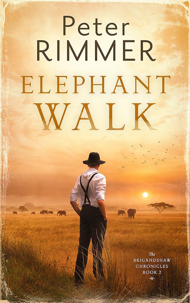
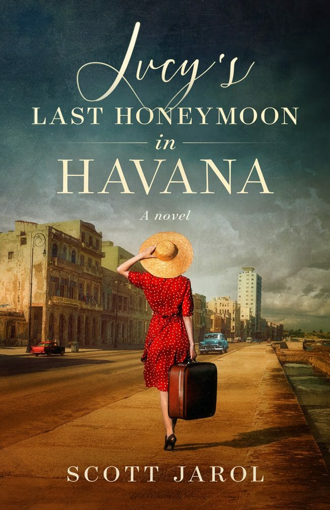
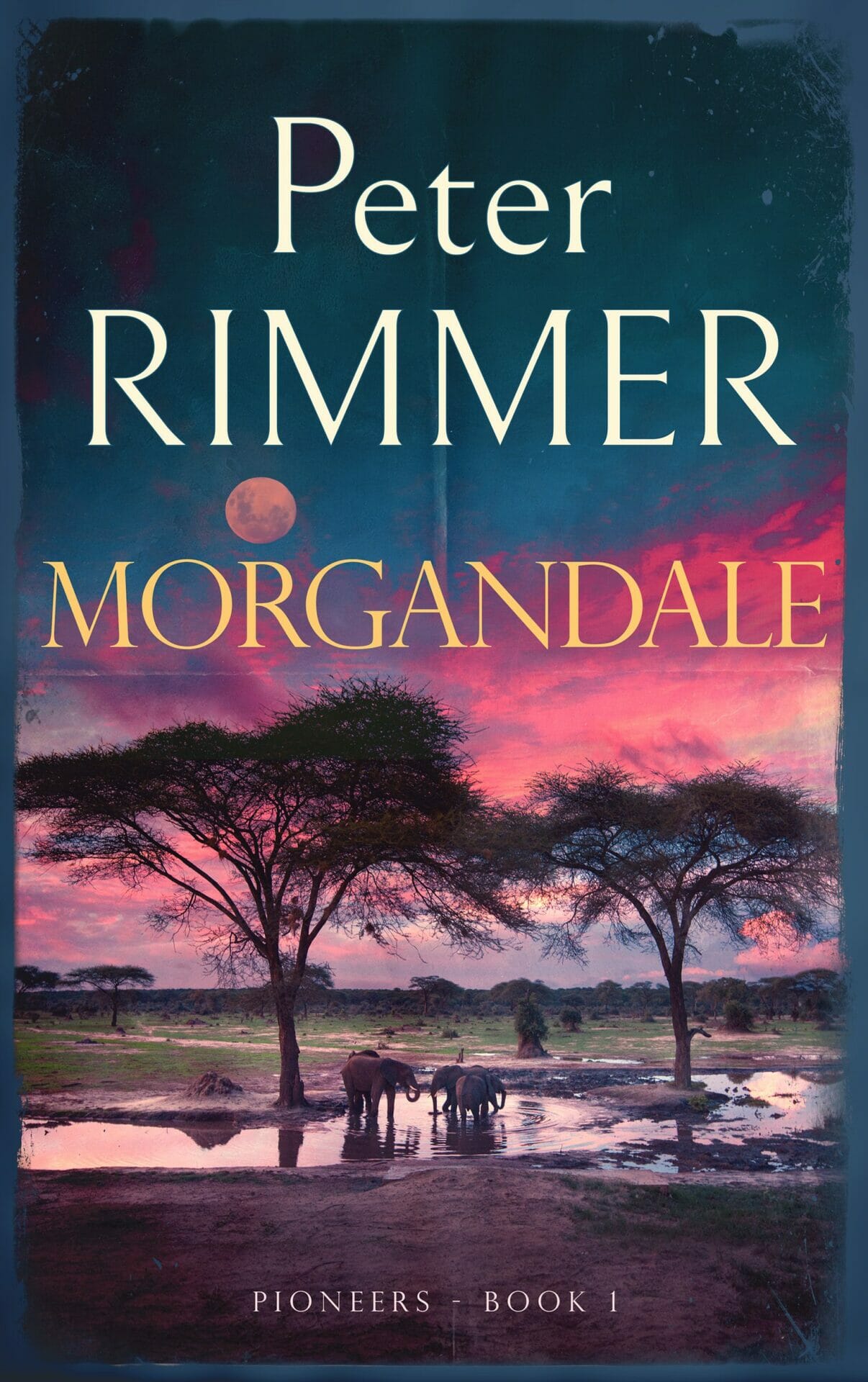
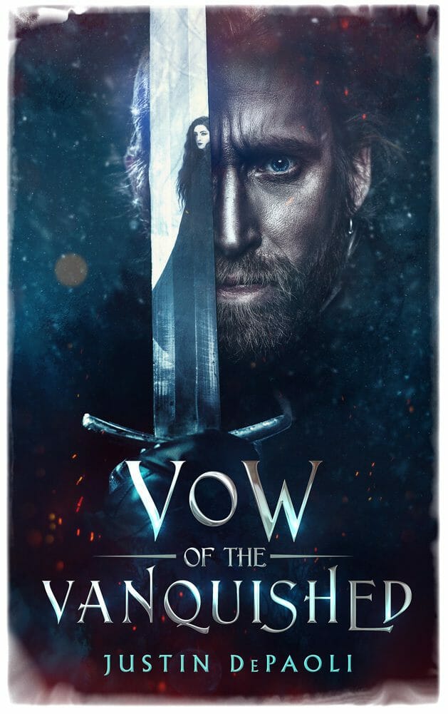
Photorealism is not bad or outdated. Photography is art. For certain books, especially those grounded in realism, biography, memoir, history, or high-tension contemporary thrillers, photographic imagery can be the most effective choice available. The problem isn’t photography itself. It’s generic, overused, or poorly chosen photography.
The same applies to every trend here. Not all of them belong on a single cover. Some books will lean heavily into one and deliberately reject another. Some will break several of them at once, and do so successfully, because the concept is strong and the intention is clear. That’s the point.
This isn’t about right and wrong. It’s about understanding why these trends exist, what pressures created them, and when it makes sense to follow or ignore them. What this article is really meant to show is not that every cover should look the same, but that effective covers are the result of informed, intentional decisions.
Every book is different. Every cover should be too.

