I know we’ve done this before, and before that, but here we are again. You’d think book covers would just sit there, quietly telling you, “I’m a serious literary masterpiece, buy me.” But no, book covers are evolving into divas, demanding the spotlight like reality TV contestants.
This is where I think book covers are heading in 2025.
1. Bright and Colorful: Moving Beyond Romance

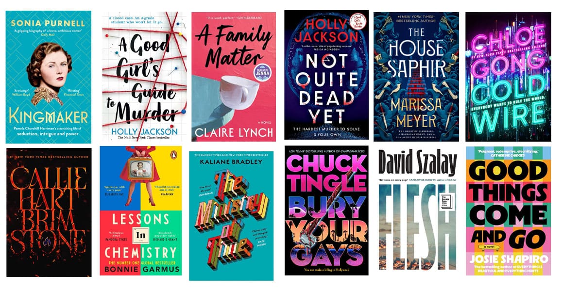
The era of muted tones and grayscale snooze-fests is officially over. Bright, bold colors are everywhere, and it all started with contemporary romance covers that looked like they were designed in a candy shop. But now, these vibrant palettes are invading every genre—fantasy, thrillers, even horror (the horror!).
That gritty crime novel? It might have a shocking pink accent. Your post-apocalyptic sci-fi epic? Say hello to vivid oranges and electric blues. Why? Because readers want their bookshelves (and eReaders) to feel like an art gallery—not a funeral procession. And let’s be honest, a pop of color is way more inviting than 50 shades of beige.
2. Symbolism Over People: Let the Objects Speak
Who needs characters front and center when a single object can tell the whole story? The trend of slapping a generic person on the cover is taking a back seat in 2025. Instead, we’re seeing covers that focus on meaningful symbols—objects, landscapes, or abstract shapes that capture the book’s essence without literally spelling it out.
That romance novel? It might feature a pair of intertwined rings instead of yet another couple awkwardly leaning toward each other. A thriller? A single bloody knife under moody lighting. Fantasy? A crown, but maybe it’s cracked and melting—symbolism and drama!
By moving away from photorealistic people, covers feel more timeless, abstract, and intriguing. It’s the visual equivalent of leaving a breadcrumb trail and letting the reader’s imagination fill in the gaps. Plus, let’s face it: no more risking the dreaded “that character doesn’t look like I imagined!” complaints.
3. More Illustration, Less Photorealism: Because Stock Photos Are Boring
The stock photo days are numbered. That overly polished, weirdly fake couple on your romance novel? Replaced by whimsical hand-drawn characters who actually look like they have personalities. Illustrations bring charm, creativity, and that “I’m artsy, not generic” vibe.
Want to make your fantasy novel stand out? Draw a dragon that looks like it’s having a bad hair day. Writing a contemporary drama? Illustrate a cup of coffee that looks like it has feelings. Whether it’s a doodle, watercolor, or vector art, illustrations bring back the human touch—because apparently, no one wants their books to look like awkward Tinder profiles anymore.
4. Very Large Type: It’s Shouting, Not Whispering
Subtle typography is officially over. In 2025, book covers aren’t asking nicely—they’re demanding your attention with BIG. BOLD. LETTERS. Titles will be so large that you’ll wonder if the author was paid by the square inch.
Expect fonts that take up 80% of the cover, leaving no room for anything else. This trend is perfect for people who judge books by their titles (because honestly, you can’t miss them). Just be prepared to explain why you’re reading a book called LOVE, SEX, AND ESTATE TAXES at the coffee shop. Everyone can see it. Everyone.
5. Thumbnail Simplicity with Close-Up Detail: “Looks Good Small, Stunning Up Close”
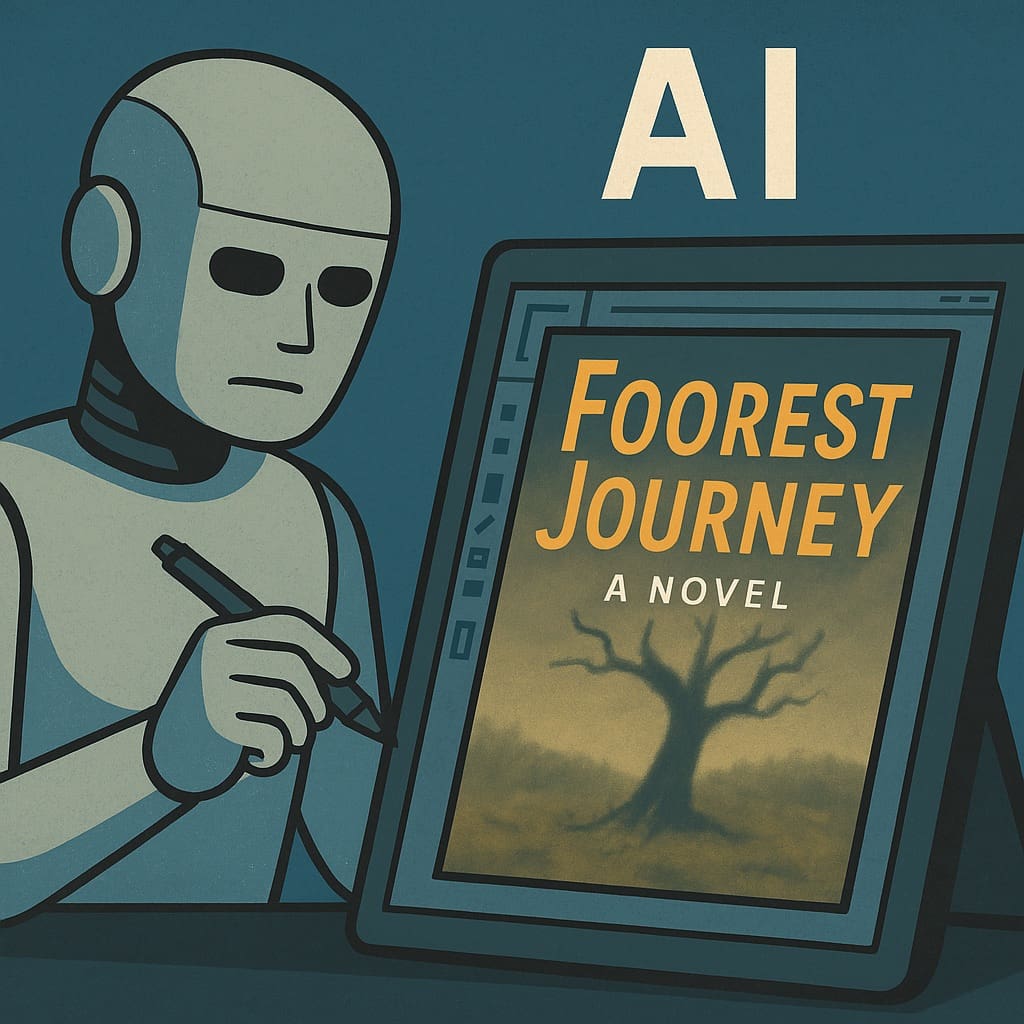
Designers are tackling a new challenge: making covers that look fabulous in tiny thumbnails (thank you, Amazon) but still impress when they’re blown up to full size. It’s like designing a tuxedo that also doubles as pajamas—functional and fancy.
At first glance, the cover will look sleek, simple, and totally “buyable” on a phone screen. But zoom in, and you’ll find hidden textures, details, and Easter eggs. Is that a secret message in the book spine design? Maybe. Is it unnecessary? Totally. But it’s 2025, and book covers are going for that “I’m minimal yet mysterious” aesthetic.
6. Animated Covers: Your eBook is Doing the Macarena
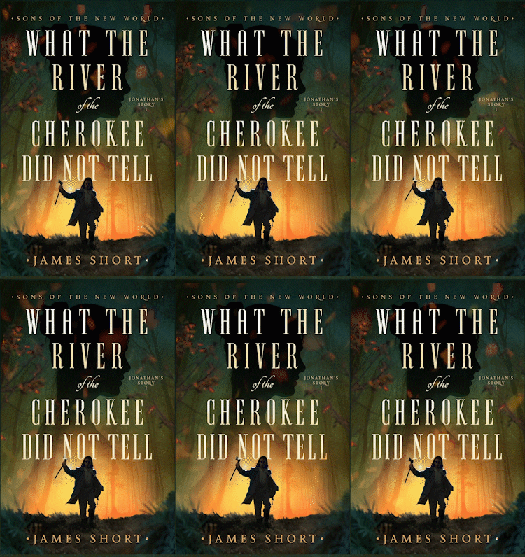
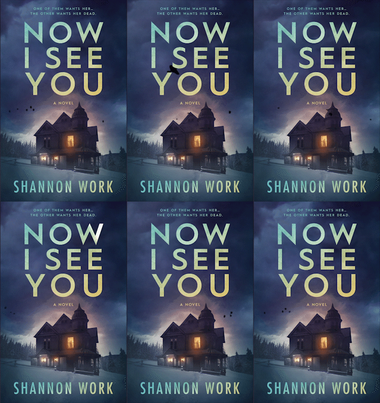
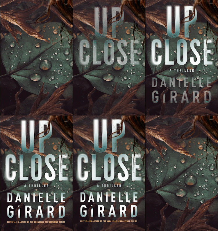
What’s better than a static book cover? One that moves. Animated covers are shaking up the digital world like they’re auditioning for “Dancing with the Stars.” That cozy mystery novel? Its cover will now feature steam literally rising from the teacup. Your sci-fi epic? Expect stars that twinkle and spaceships that zoom across the screen.
While you might think, “Cool! Animated covers are the future,” it’s also a hilarious reality for eBook readers who accidentally open their Kindle app in public, only to have their book’s cover scream, “LOOK AT ME!” Animated covers are the book world’s way of saying, “If GIFs can get famous, why can’t I?”
Worried your cover may not be up to scratch? Worry no longer with a comprehensive (and FREE) book cover review from Damon Freeman, creative director of Damonza.com.


