This article is actually the first part of another article on The Five Best Book Cover Designers for Self-Published Authors (link at the end). I’ve split this section off as this separate article, and added to it, because it should really stand alone.
Firstly, there are many so-called book cover design services out there. Probably thousands. I’ve certainly had a look at many hundreds. And the overwhelming majority of those service providers are, basically, not very good. They’re not terrible, like I-used-MS-Paint-to-design-my-own-cover bad, but they’re not good, and they’re not actually helping the author sell their book. They’re just providing an image with text for the author to use as a book cover. For the most part, that book cover is not actually doing anything for the book. In fact, based on the covers that I’ve seen in the author groups I’m part of, the many covers I’ve reviewed, and the related sales of all those books, the vast majority of self-published covers are actively harming the potential sales of the book. I’ll get to the reason for that shortly.
Secondly, within that collection of thousands of service providers, there are a small group of really talented book cover designers, who are clearly capable of designing interesting, creative, and clever designs (many of whom are named in other “top cover designer” lists), but they’re not commercially useful designs. It’s a bit like those high-fashion outfits that involve wearing plastic bags or having silver spikes on the knees that appear on the modelling runways. They may receive plaudits from other designers, or appreciative pats on the back from the art community, but for the regular independent author, it just won’t work. Firstly, they’re expensive, and secondly, those designs usually only work for books that are already commercially successful, and are released as limited edition covers, or they’re part of a weird fringe genre that’s not really interested in actual book sales.


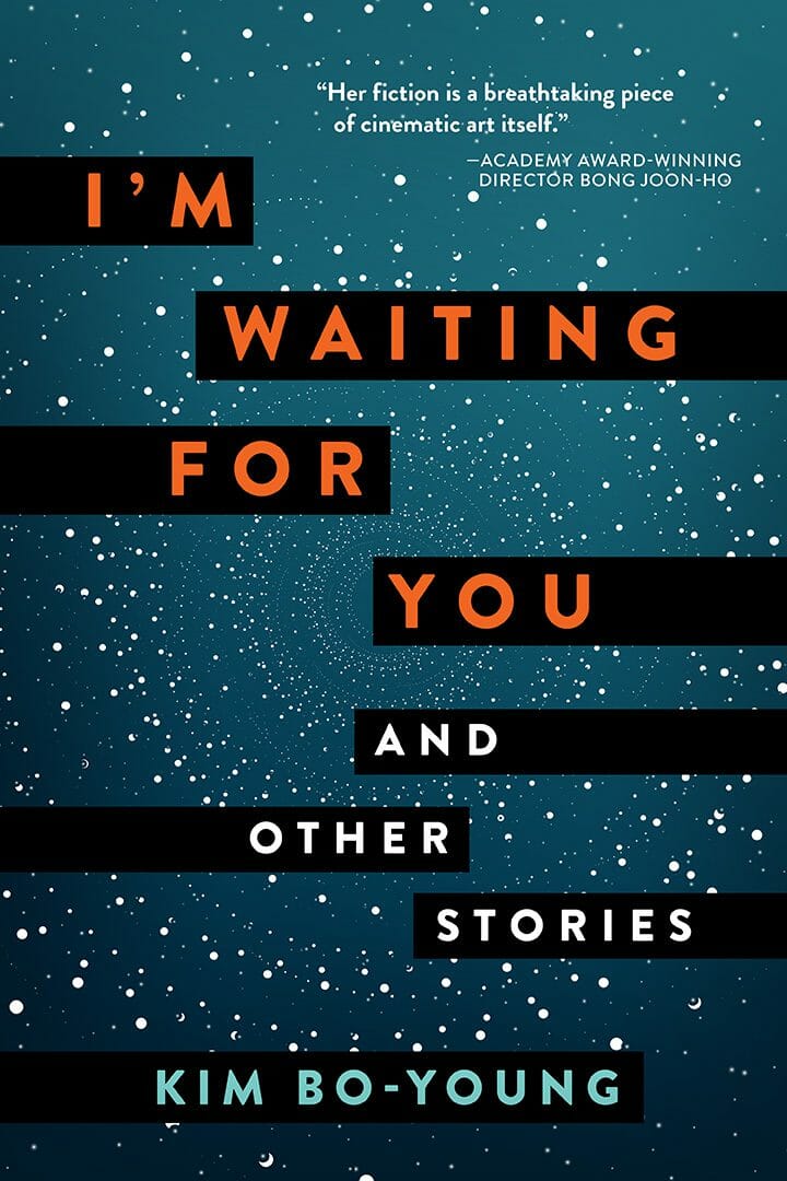
Clever, but not appropriate for most self-published authors
Thirdly, there are a group of cover designers or cover design companies that do amazing work, creating incredible book covers that can and do compete with the traditionally published bestsellers, but they’re expensive (a few thousand dollars and up). Usually, they’re worth it. For the most part, these designers are designing the traditionally published bestseller covers. But they may be out of reach financially for most independent authors. You can tell who these designers are by their amazing portfolios and lack of pricing on their websites.
"I’m going to tell you the reason why the vast majority of self-published covers are damaging the potential sales of the book."
I’m going to tell you the reason why the vast majority of self-published covers are damaging the potential sales of the book. When I started Damonza around 12 years ago, there weren’t that many specialist cover design companies around. Of those that were, the overall quality of the designers was pretty good. Many independent authors either designed their covers themselves (not good) or had one of the few specialist cover designers do it for them (better). But there was generally an obvious home-made vs. professionally designed cover difference. And that difference translated to obvious sales differences as well.
However, since that time, thousands of cheap “professional” cover design firms have set up shop. Although they’re usually (not always) better than the home-made covers, the substandard quality of the cover is often not obvious to the author who’s close to the project. But it is obvious to the potential reader of that book.
Here’s the thing. The author is trusting the designer to create a cover that represents only their book. But the reader is comparing all the books to each other, and deciding where they’re going to spend their money. And in that group of “all the books” are the traditionally published, big-budget, professionally designed bestseller covers. When the self-published author’s book cover is compared to those covers, the relative difference in quality of the cover design is crucial. How well does it compare? If the cover is not of the same standard as those traditionally published book covers, it looks comparatively amateur, which makes the potential reader assume it is comparatively amateur (regardless of how compelling the content is) and why should they spend their money on an “amateur” book?
"These cheaper 'professional' cover design firms are very good at promoting themselves, and very good at giving the author what they think they want. But that doesn't mean they’re providing the author with a cover that can compete with the traditionally published book covers and actually sell the book."
These cheaper “professional” cover design firms are very good at promoting themselves, and very good at giving the author what they think they want. But that doesn’t mean they’re providing the author with a cover that can compete with the traditionally published book covers and actually sell the book. Very often, even though the author may be spending fortunes on marketing their book, and they believe they have a professional book cover, they’re still not getting enough people to actually buy the book. Even when everything else is done right, an amateur-looking cover, even if designed by a “professional,” will actively harm the sales potential of a book.
How do you tell the difference between a great book cover designer and a mediocre book cover designer?
This is not always easy, for a few reasons. For one thing, genre matters. The specific skills required to create an amazing cover in one genre (e.g. romance) generally don’t correspond to the skills required in another genre (e.g. self-help). Although a highly experienced designer may have gained all the skills required to design covers across multiple genres, that does take a lot of experience, time, and practice. Even within Damonza, our designers are specialists in different genres. Although our amazing fantasy genre specialist could design a suspense thriller cover, it wouldn’t be as good as the one designed by our suspense thriller specialist designer. That difference in cover quality affects the sales of that book in a highly competitive market.
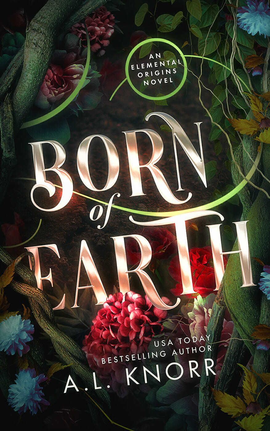
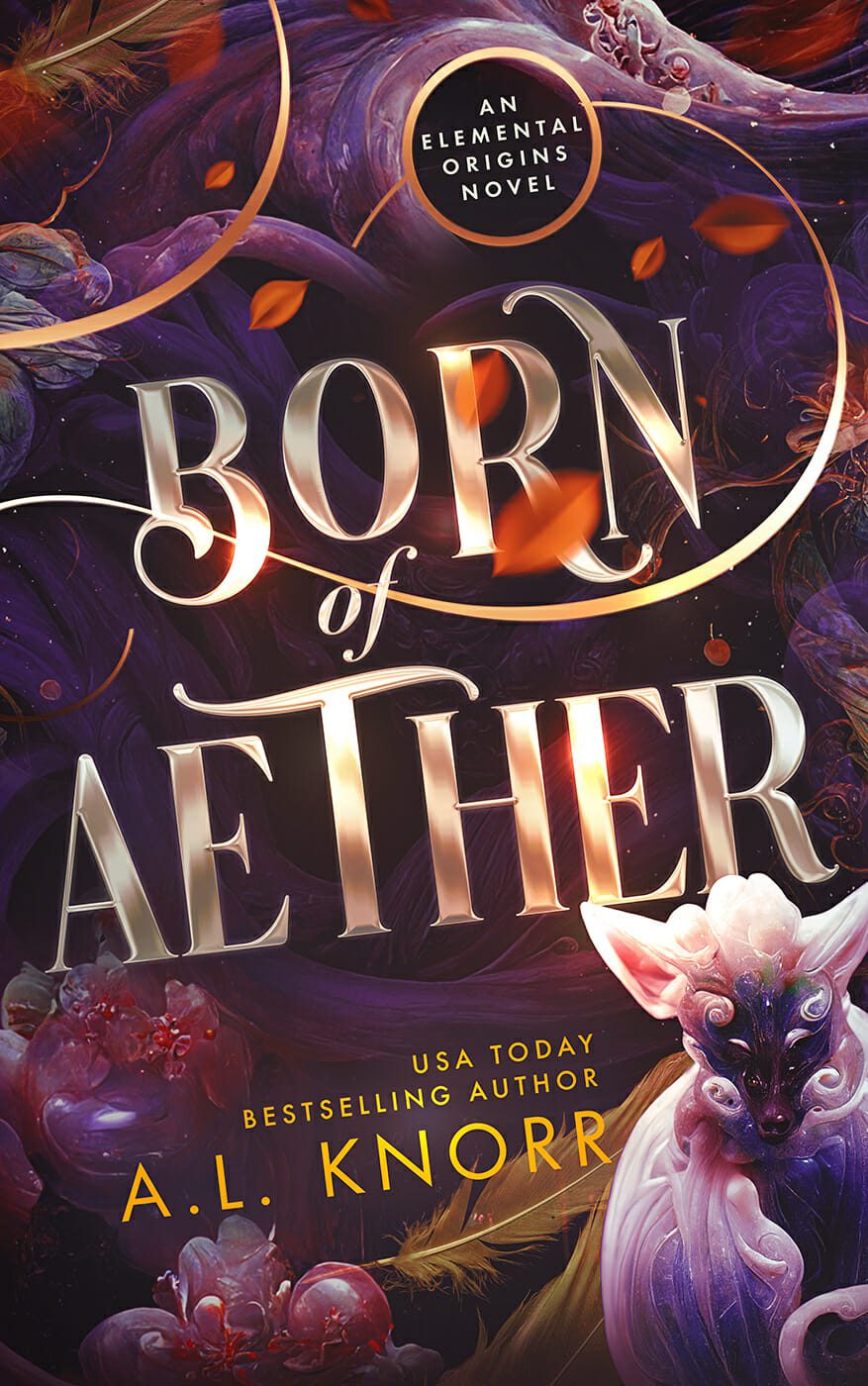
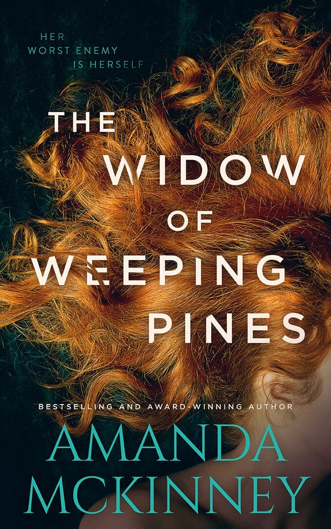
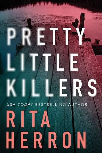
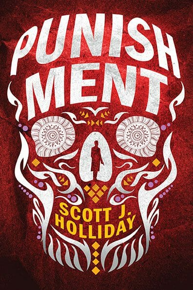
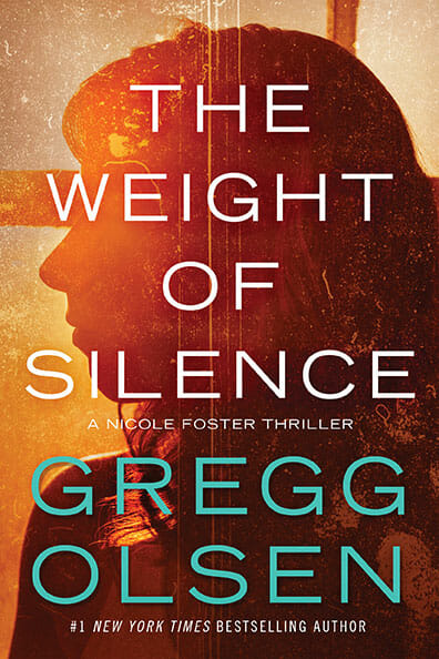
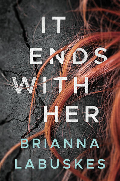
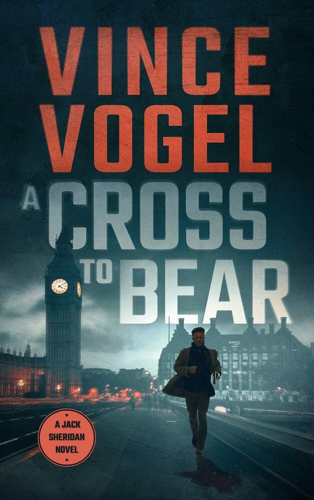
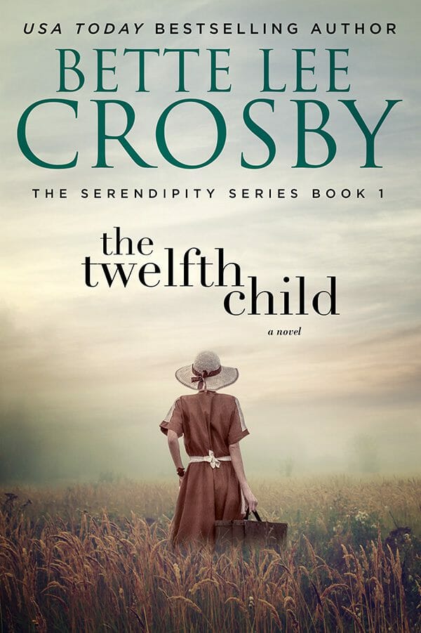
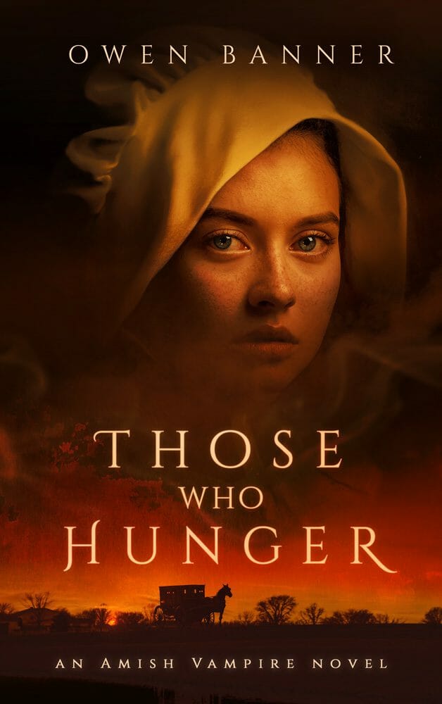
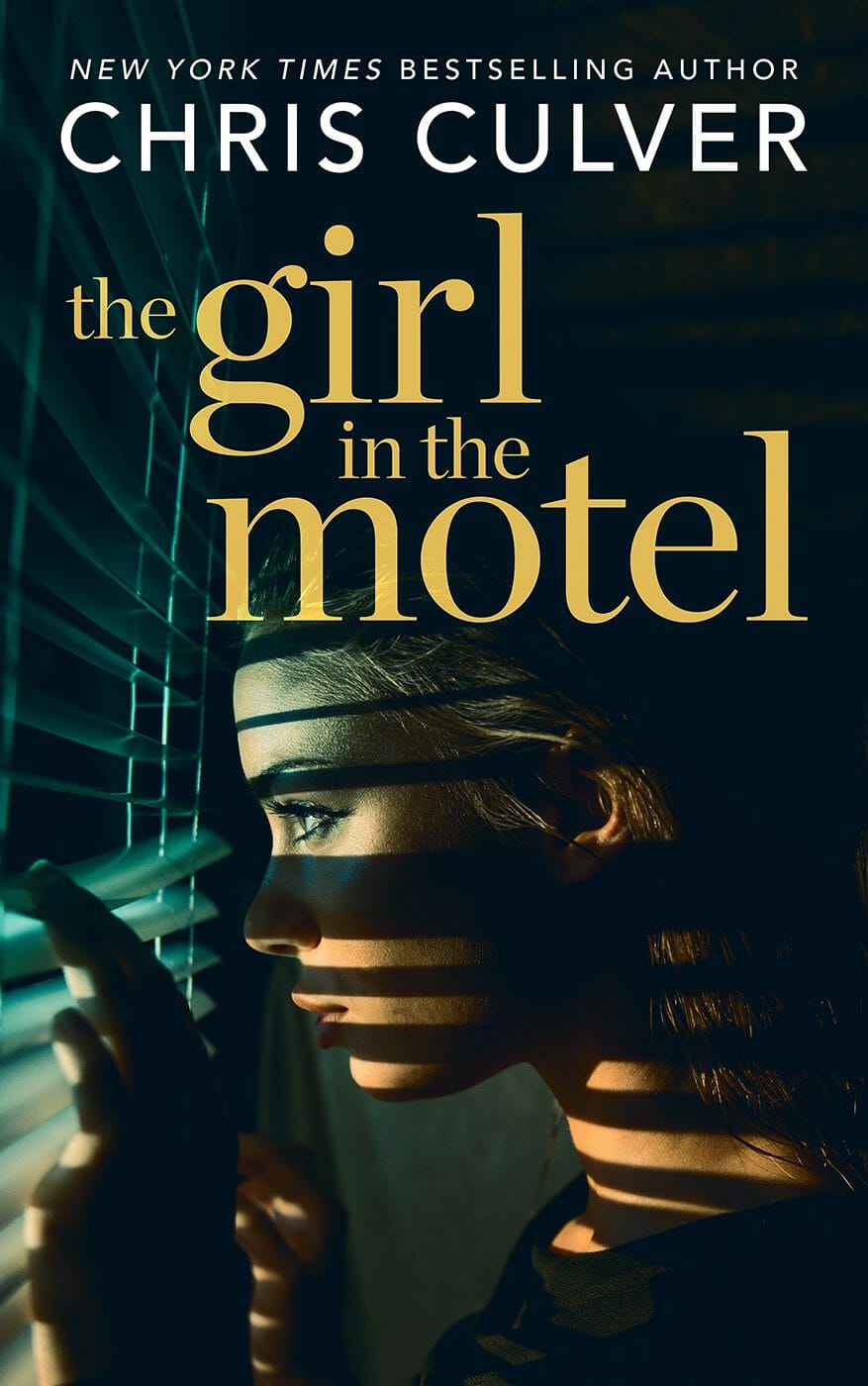
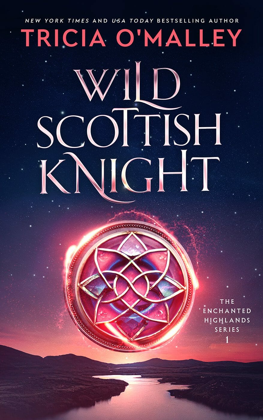
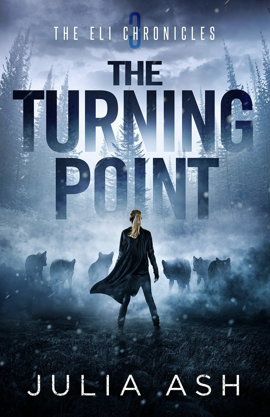
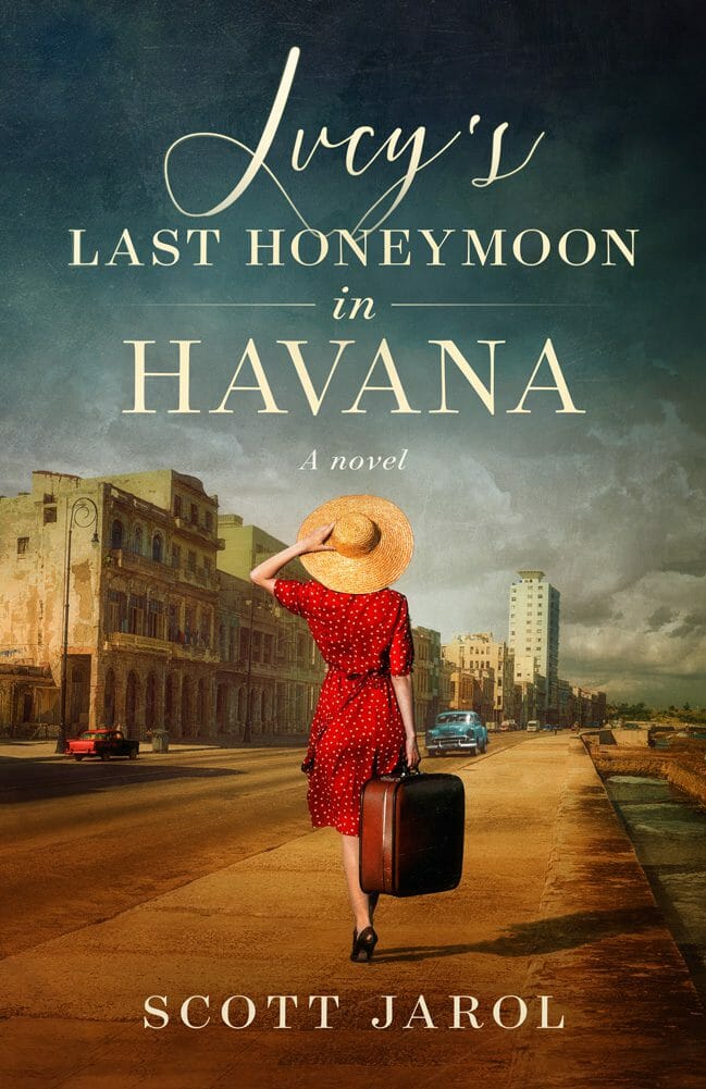
Therefore, it’s crucial, when considering the quality of a designer, to look at examples of their work within your preferred genre. And compare those examples to the traditionally published bestsellers within the same genre. This comparison is important. Traditional publishers have teams of people whose sole job is to assess the marketability of the book cover. Remember, they only make money when the book sells, so they put a lot of thought and research into what makes a sellable book cover. And if that book is a bestseller, then you know that it works. That’s where you can take advantage of all their hard work. When looking for a good cover designer, compare their portfolio examples to those of the current bestsellers. Look at the styles of images used, the overall layout and, very importantly, the typography (the styling and typefaces of all the text on the cover). And if the cover designer already has bestselling cover examples as part of their portfolio, or if they already create cover designs for traditionally published bestsellers, even better.
Another challenge is that much of it is subconscious. If you haven’t analysed a lot of covers, it’s not always obvious whether or not a particular cover may or may not be effective in selling a book. An attractive image doesn’t always make an effective cover. Something that may look amazing when framed on a wall could fail dismally when wrapped around a book. So, as a non-expert, how do you know?
Here are 3 things to look out for:
Photographic vs almost photographic vs illustration
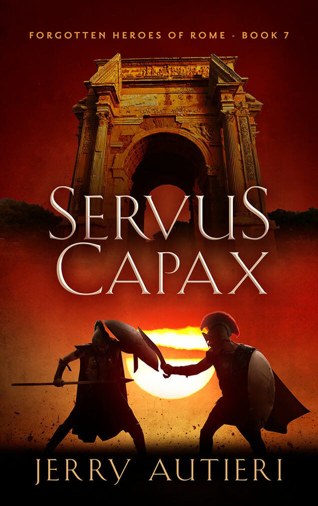
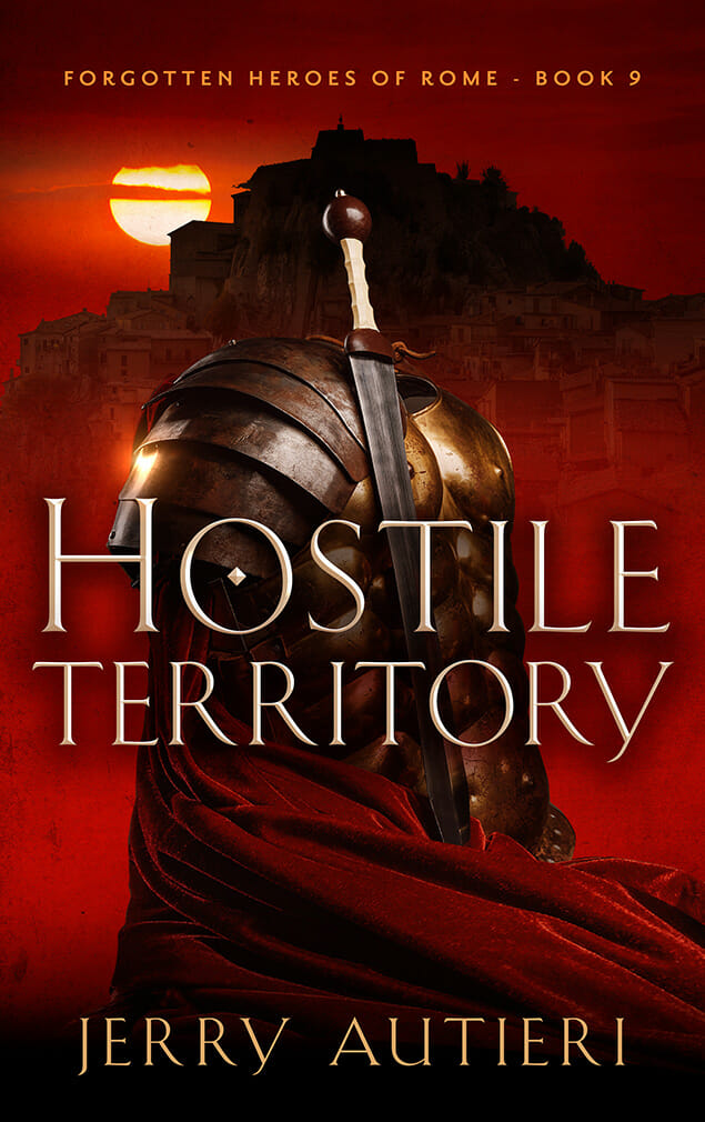
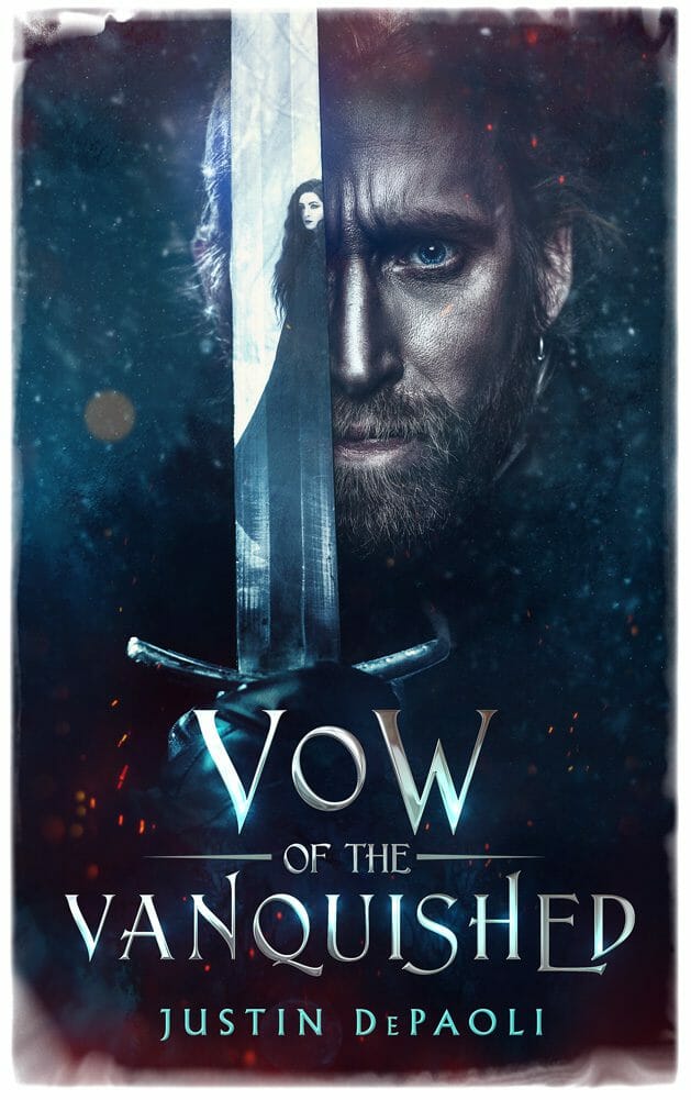
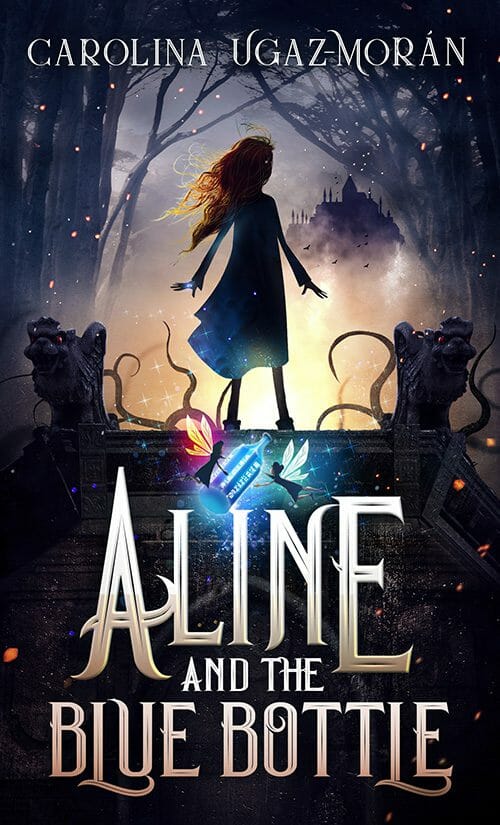
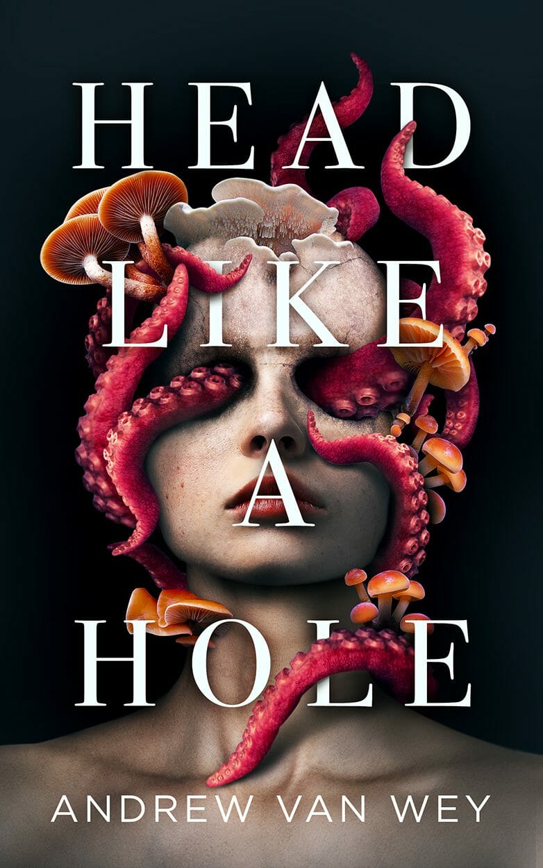
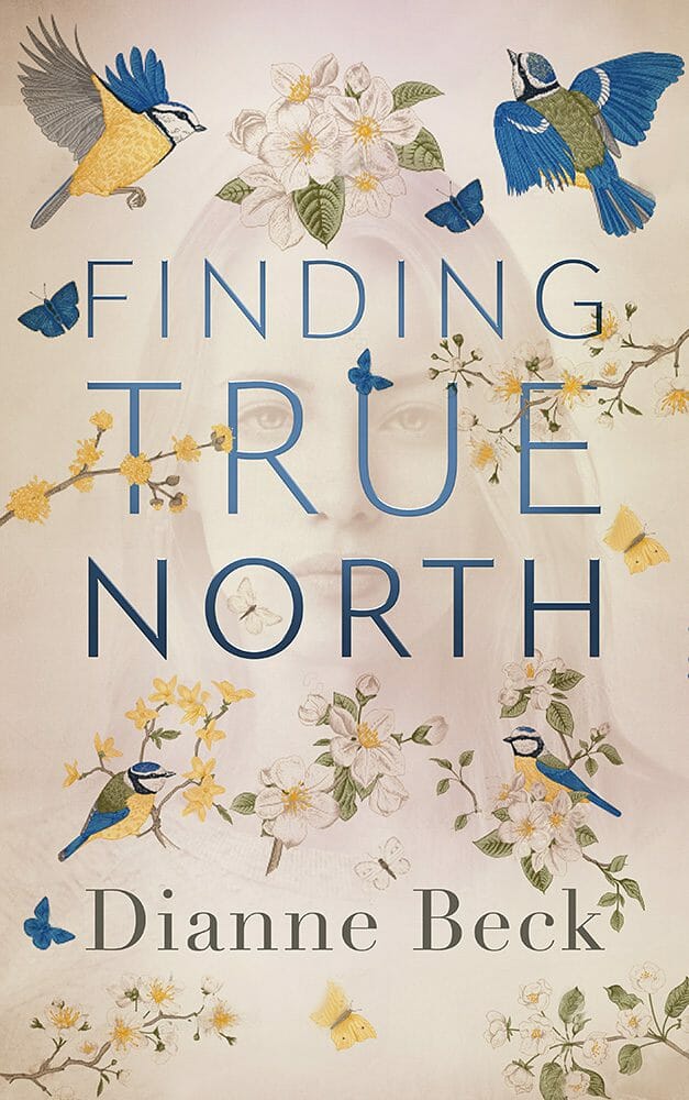
This is one problematic element that I see quite often. Some genres are more suited to illustration, and others are better suited to photographic images. There are certainly sub-genres that can be both (not within the same cover), but a common mistake I see from cover designers is using an illustration/3D rendering when it should be a photographic cover. Often, this takes the form of trying to show characters and expressions through a realistic illustration or 3D rendering, but because it isn’t a real photograph or person, it hits that “uncanny valley” effect, pushing a potential reader away, rather than drawing them in. These designs commonly crop up in the fantasy genre. They’re the ones with the unnatural, stiff poses and the blank faces. This isn’t to say that illustration shouldn’t be used for those genres, but rather that it shouldn’t be used in the same way that a photographic image would be used. If going with an illustration for a (non-children’s) fiction cover, it should be a relatively simplistic or icon style cover, or a fun, humorous style cover. But going with “look how realistic this illustration is” is never a good idea.
This sometimes works the other way as well, when an illustrated cover would clearly be better, but a photographic stock image (or combination of photographic stock images) has been manipulated so much to “look artistic” that it’s totally unnatural and plastic-looking. The manipulation effects on a book cover could be compared to the special effects in a movie. If you take notice of them, they’re not good. You should be attracted by the book cover as a whole, and not notice the separate parts that make up the cover.
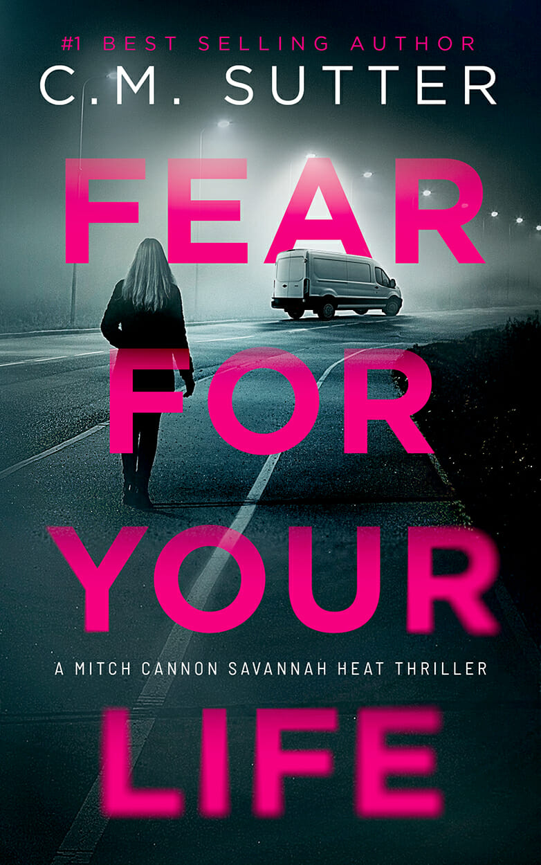
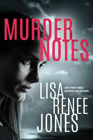
Typography
The typography (text choices, treatment and layout) is one of the main differentiators in quality of book cover design. The fact is the best book cover designers are masters at typography. In fact, they’re so good, that usually you don’t notice it at all. Just as if you were reading a book and if it’s laid out correctly, tehn you don’t notice the fonts, or line breaks, or spacing, or alignment. But when it’s just slightly “off,” it can throw out your entire reading experience. The same applies to the book cover. And this is where so many cover designers struggle, even some of the “professional” ones.
There are so many ways to get it wrong. These are the most common problems:
- Wrong typeface choices – too thin, too finicky, too complicated
- Too plain – This isn’t a business document. Don’t use business document fonts
- Too small – Why the teeny tiny author name?
- Too white – There are other colors. Use them (but not too many)
- Too many effects – No drop shadows. It’s lazy and separates the type from the cover when it should be integrated
- Still too many effects – Overly photoshopped and looks cheap (bevels + textures + shadows)
- Unbalanced – Why squeeze it all in to the top, or bottom? Why split it all the way at the top and bottom with this wide open space in the middle?
- Too dark – Needs to be legible. Red text in any color other than white is VERY hard to see. Use it sparingly.
- Outlined text – Unprofessional. This shouldn’t happen.
- Too close to the top/bottom/sides – Every cover has margins and needs breathing room. Space is important
- Spacing – Too much kerning, not enough leading.
All of these issues are common on self-published book covers, even “professionally desingned ones” but NOT on the traditionally published bestsellers. And without experience, it can be difficult to pinpoint these mistakes. But they do impact the overall impression of a book, and how it’s perceived by potential readers.
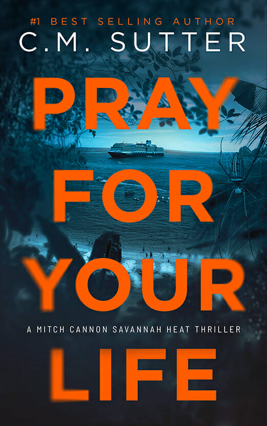
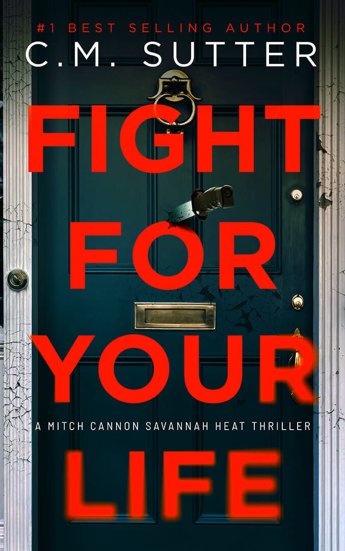
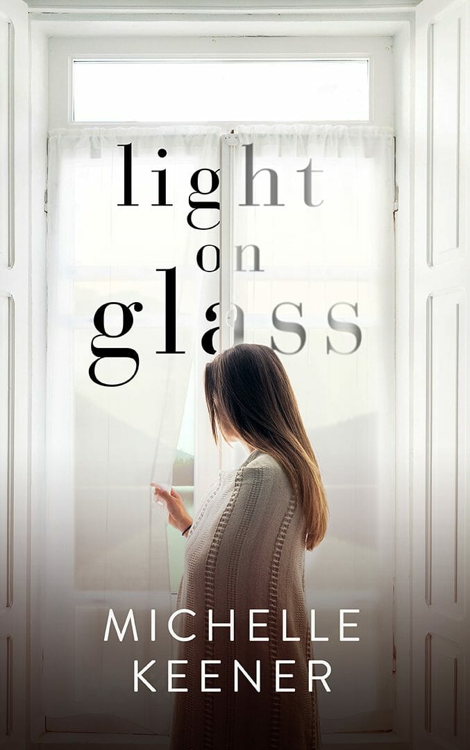
A Solid Focal Point
Every cover needs a focal point, something that grabs the attention of a potential reader. However, a common error is trying to fit too much on to a single cover, so that there is no single strong focal point. Then it gets too muddied, and too busy. Multiple focal points on one cover dilute each other, making it less effective. The best covers only have a single strong focal point, whether it’s part of the image or the text. If you can’t point to the “one thing” to rest your eyes on, it won’t work.
There’s clearly more to it, and to be honest, it’s not easy to explain the many differences in book cover quality that you’ll get from different book cover designers. If you want the best outcome for your book, it’s crucial that you get the cover right, and finding the best cover designer for your book can be difficult. To give yourself the best chance, these are the steps to take:
- Look at their portfolio for book covers that are clearly in your genre. If there are authors you recognize and respect, that’s a great sign!
- Compare those covers to the bestsellers from the traditional publishers in your genre
- Check the pricing and availability of those designers. Remember, as in most things, you get what you pay for.
Not sure about your current book cover? Get your current book cover reviewed for free here.
