I run a book design company. I've been doing that since 2011, when it was only me, basically working as a freelancer doing book cover design as a side hustle while also working as a creative director for an advertising agency that specialized in sports.
Fifteen years later, that side hustle has turned into over 14,000 book covers, and I run a team of eight designers producing more than 100 covers a month.
But it was the advertising experience, and the sports work in particular, that taught me something valuable and surprisingly transferable to the design of book covers. I'll come back to it, because it's the whole point. But first I want to put the cover in its place, because most authors misjudge what it's actually for.
Selling a book comes down to three things
Before we talk about covers, let's zoom out and look at how a book actually gets sold. It comes down to three things, in order.
Step one: you need to be seen. Eyeballs. This is everything that gets your book in front of a reader in the first place. Choosing the right category and subcategory so you're showing up where your readers actually browse. Keywords and metadata that match what people search for. Promotional placement, whether that's a paid feature on a newsletter like BookBub, an ad campaign, an Amazon promotion, or a price drop that pushes you up the charts. A launch plan, a mailing list, reviews coming in, word of mouth. There's a whole craft to this, and entire careers built on it. It's not what this article is about, but it's step one for a reason: none of the rest matters if nobody ever lays eyes on the book.
Step two: you need the right cover. Once you've earned those eyeballs, the cover is what converts them into clicks. Someone is scrolling a crowded category page or scanning a shelf, moving fast, and your cover has a fraction of a second to make them stop and look closer. Getting seen is a numbers game you can win and still lose, because all that traffic is wasted if the cover doesn't do its job at the moment of attention. Step one buys you the look. The cover is what turns the look into a click.
Step three: you need the right blurb. And I need to be clear about what I mean by blurb, because the word gets used two different ways. I'm not talking about the review quotes, the "a thrilling, unputdownable masterpiece" lines from other authors or publications. I mean the description of the book itself: the back cover copy, or on Amazon, the product page description. That's the blurb that matters. That's the part that actually closes the deal and sells the book. The review quotes and editorial endorsements help, and reader and editorial reviews help even more, so get them if you can. But they're support. The description is the closer. It's what takes someone who's curious and turns them into a buyer.
But here's the thing about all of that. The blurb, the reviews, the description, none of it gets a chance to do its job if the cover hasn't already done its job first. A reader has to want to click before they'll ever read a word of your description.
So the rest of this article is about step two. About what actually makes someone click.
What actually makes someone click
Here's the thing my years in sports advertising taught me, and it's the whole point: people respond to emotion more than information.
When you're promoting a sport, your job isn't to explain the sport. It's not a description of the rules, or a rundown of which teams are playing and who's on the roster. None of that is what fills a stadium or gets people to tune in. What does that is emotion. You're building anticipation for the action, the drama, the rivalry, the passion. You're setting an emotional expectation in advance, through the visual choices you make, before a single ball is kicked. That expectation is what people actually respond to. Get it right and they show up excited for something they haven't even seen yet.
Book covers work exactly the same way, and for the same reason. The cover isn't there to explain the book. It's there to set an emotional expectation for it.
The trouble is that with book covers, especially for new authors and new books, there's no inherent emotion attached to the book yet. There's no reason for a reader to be emotionally attached to a book they know nothing about and have never heard of.
This is what a lot of authors miss when they plan their cover. The mistake is thinking too much about the information on the cover, and not enough about the emotion a reader might feel when they see it.
It comes down to two questions. An author looks at their cover and asks, "Does this represent my book?" A reader looks at it and asks, "Do I want to read this?"
The whole game lives in the gap between those two questions. And the cover sits right in that gap, so it helps to be clear about what it's actually for.
The cover is just the door
The cover's job is to make a reader want to open the door. That's it.
Whether that means clicking a thumbnail to get to the product page on Amazon, or picking the book up off a shelf, the cover is the door. And a door doesn't need to tell you everything about what's inside. It just needs to make you want to open it. You've got two to three seconds to make that happen, and the only thing that works that fast is emotion.
So we're back to the hard part.
How to create emotion for a book nobody has heard of
How do you create an emotion with a cover for a book that nobody knows? I'll tell you.
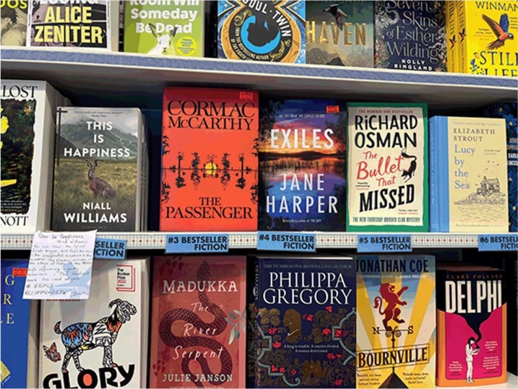
You've probably noticed that the most popular books in most genres, the big bestsellers, are for the most part traditionally published by big publishers with big budgets. I think we can agree that's a fact, whether or not we like it. That's how it is.
And your book is competing with those books. Those bestsellers, with many thousands, maybe millions of readers. Against your book, with (presumably) fewer than that.
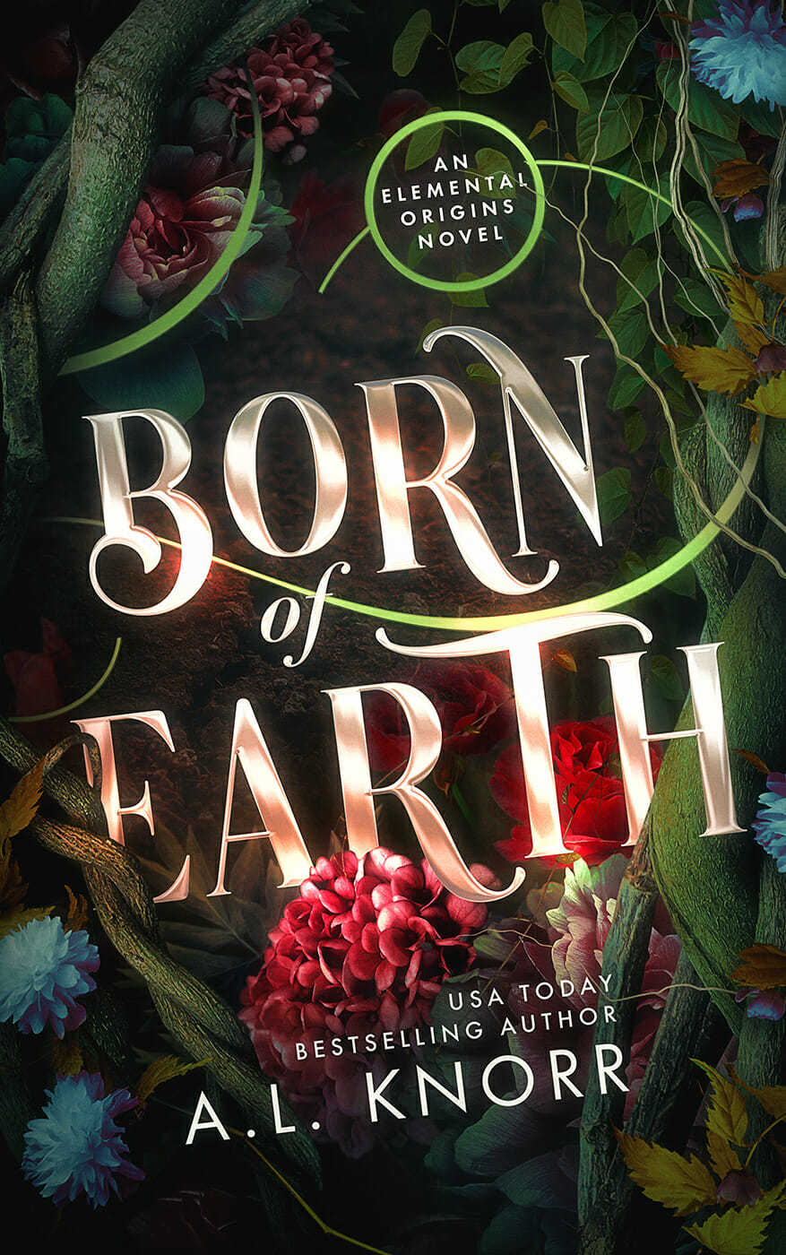
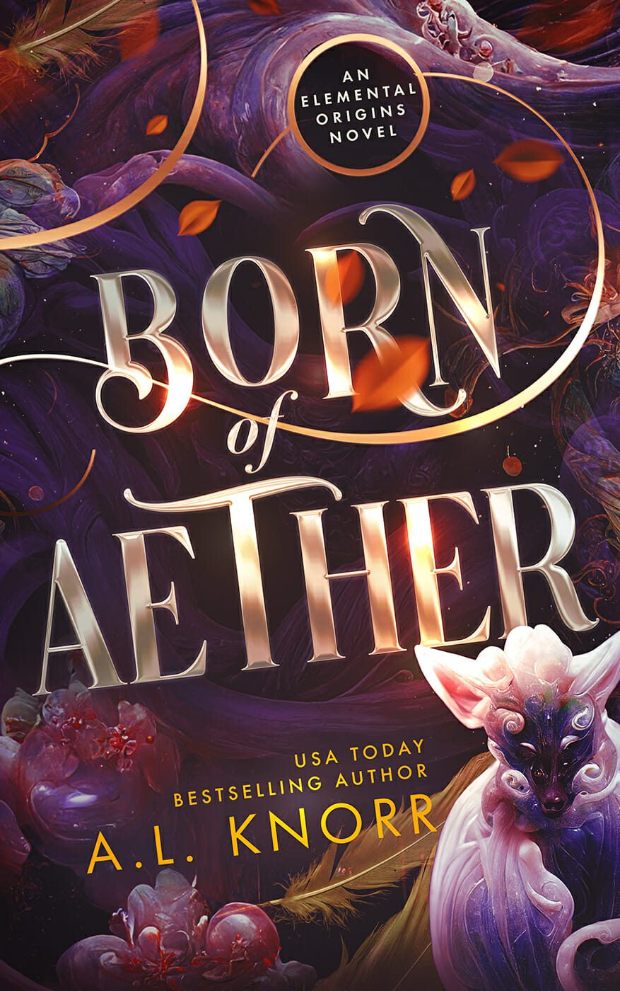
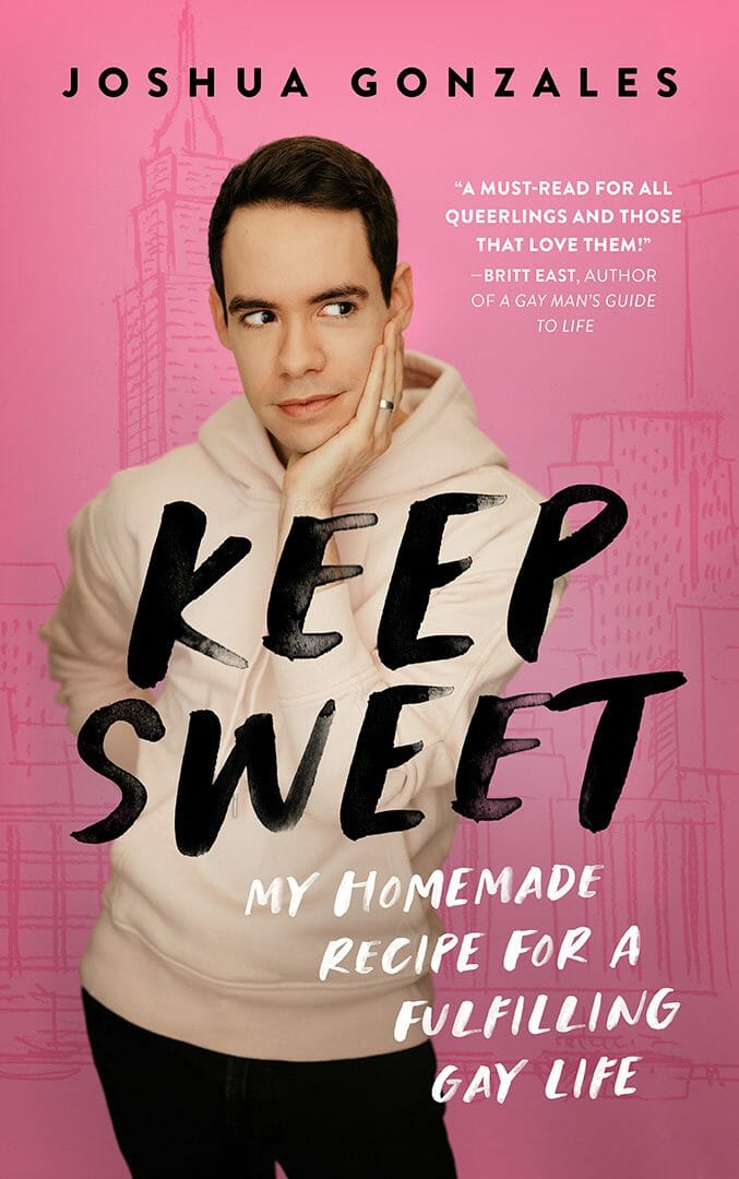
But that's okay, because you can use it to your advantage. You have their template to work with. Those books have already created the emotions you're looking for in your readers. What this means is simple: Be like those covers. Don't be different.
Your cover should remind readers of the books they've already connected with and already enjoyed. They need to feel they'll get that same emotional experience from your book, and that's why it belongs on their shelf or their Kindle beside their favorites.
"Don't be different" may sound counterintuitive. You probably want your cover to stand out. Maybe so, but first you need to fit in. Don't copy other covers. But use the logic behind them. This strategy is exactly what the top performing books already do. It's why trends exist. It's why genre indicators are what they are. They're a visual shorthand. Those trends are the trigger that tells a reader, within a second or two: this looks like other books you've enjoyed, so you'll probably enjoy this one too... Click.
What that looks like in practice

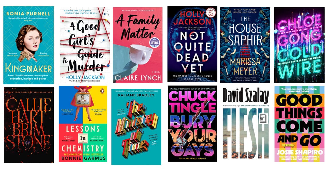
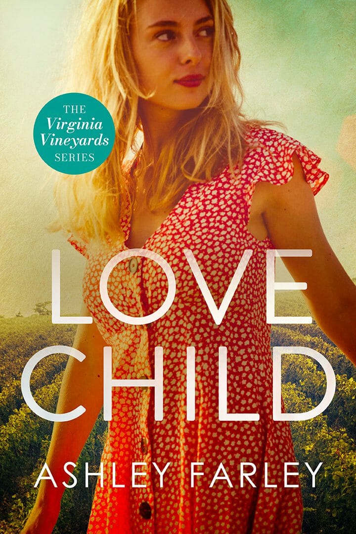
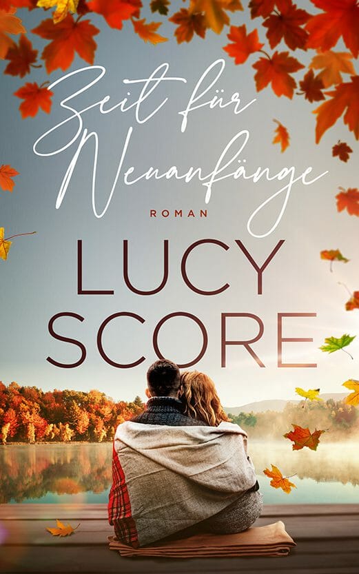
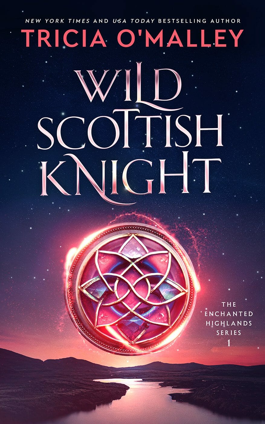
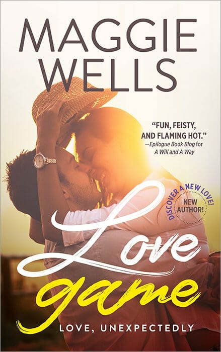
Think about contemporary romance. A few years ago the covers were all the same look: moody, beautiful people, cufflinks, six-pack abs. Now look at the genre and it's something else entirely: simple, colorful illustrations.
That illustrated style is the current genre shortcut for contemporary romance. If that's what you're writing, and you want the emotional response before a reader even knows what your book is about, that's what your cover should look like. Don't overthink it.

The clearest way to see the shift is to look at the same titles over time. Plenty of romance series that launched a decade ago with black-and-white photographs of torsos have since been repackaged as bright, illustrated, hand-lettered covers. Same books, same authors. The market moved, and the covers moved with it. (If you're a stock photo model who specializes in having abs, it's been a difficult few years.)

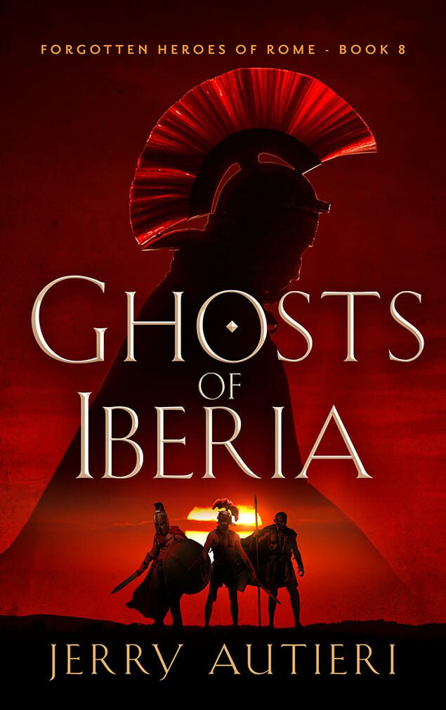
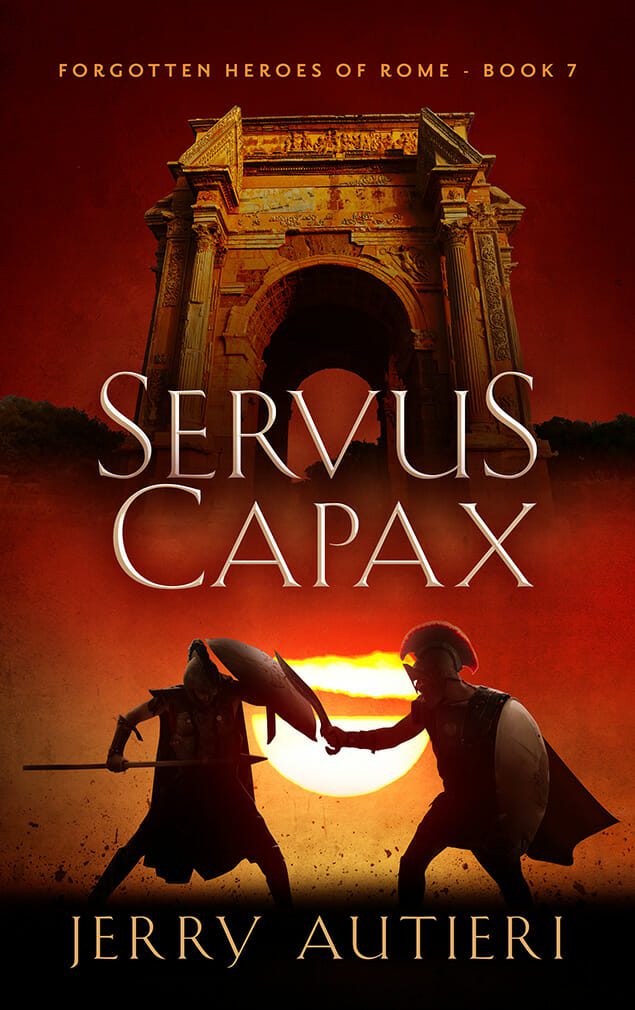
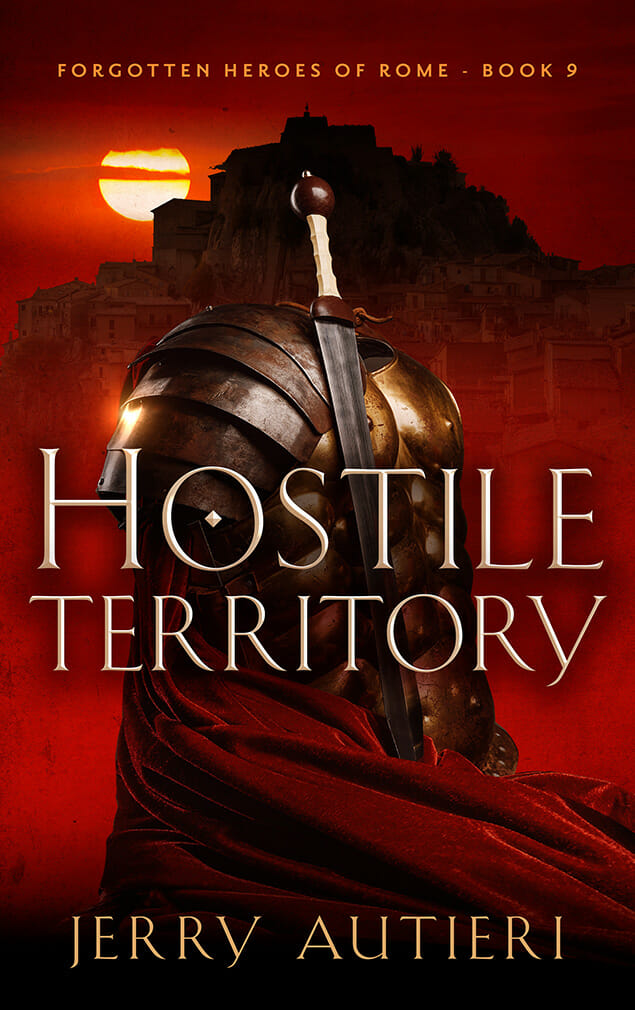
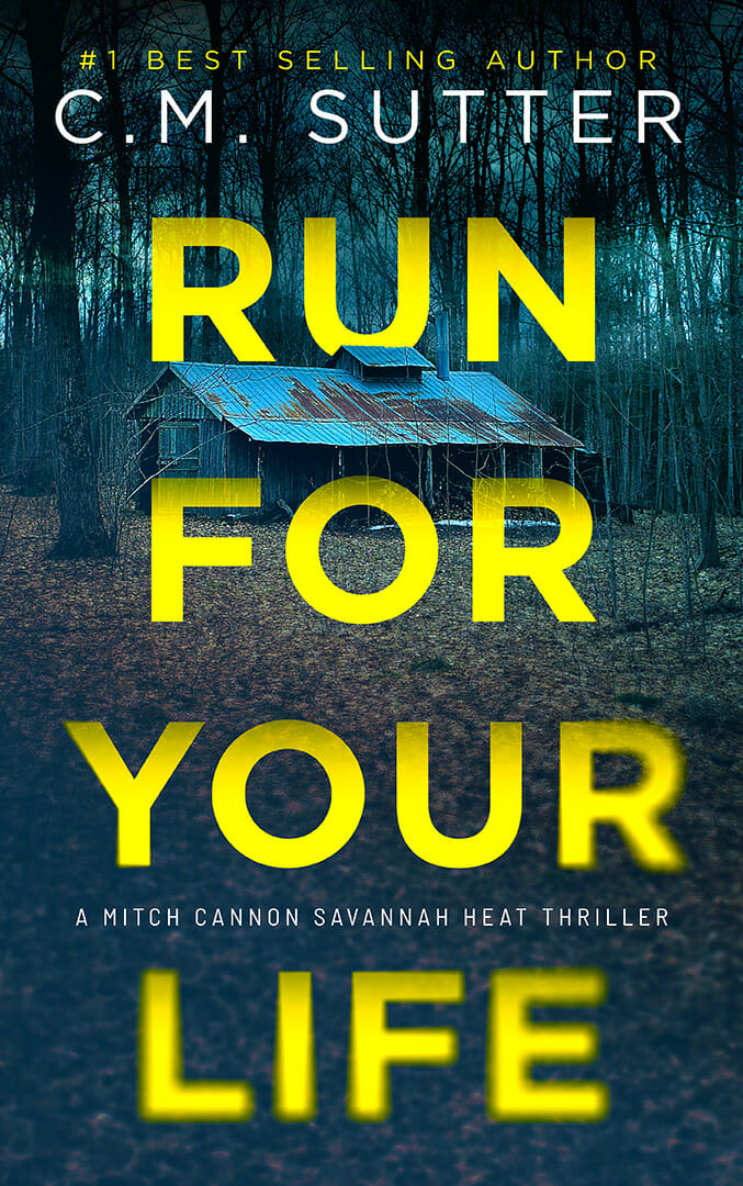
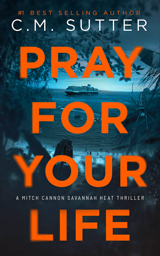
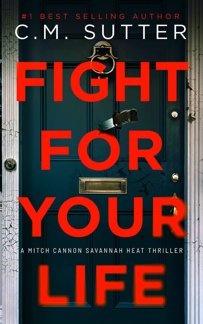
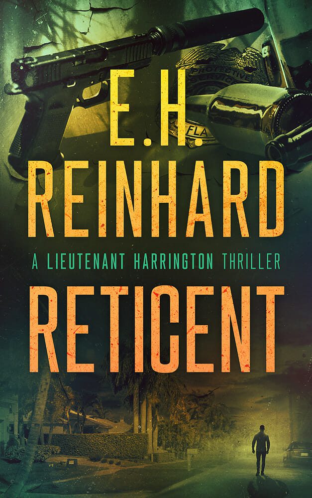
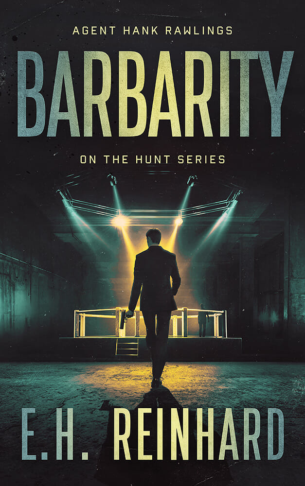
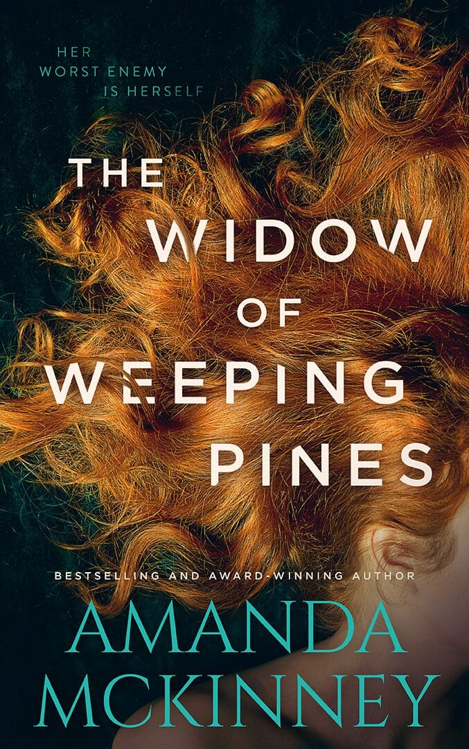
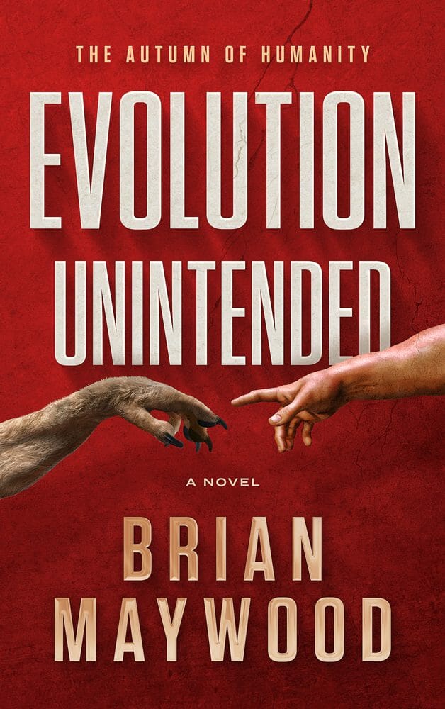
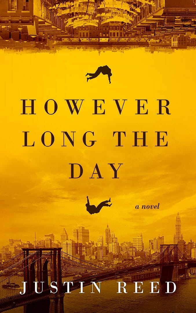
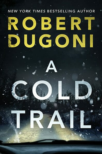
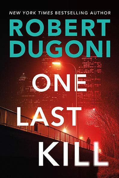
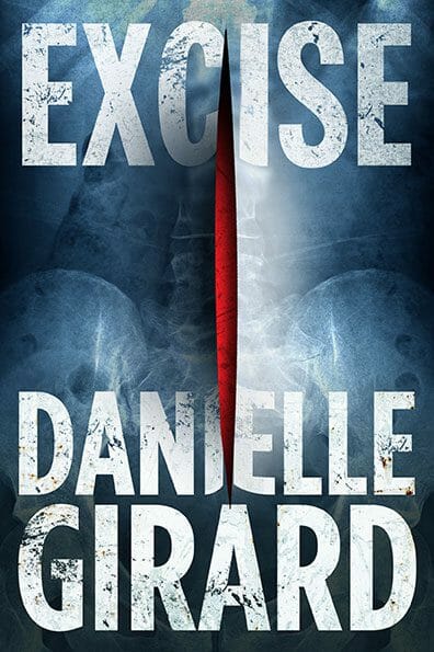
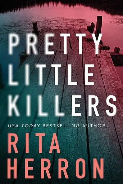
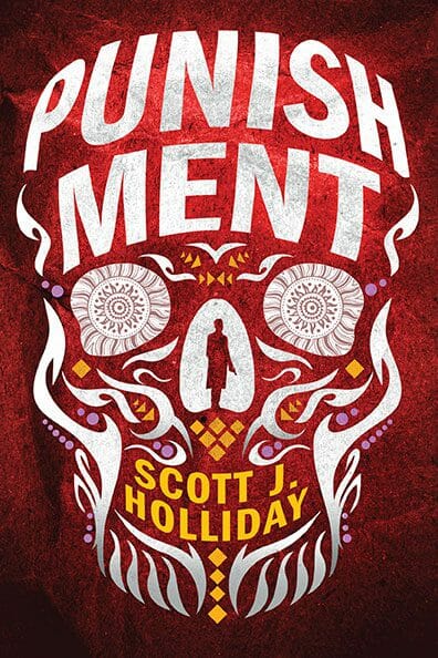
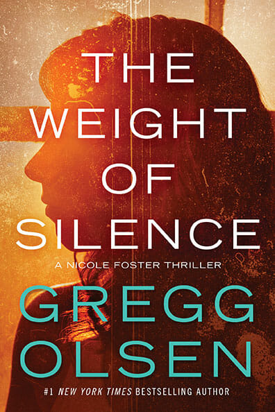
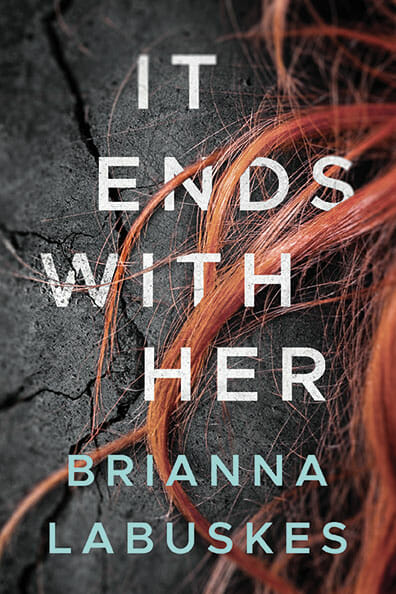
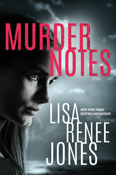
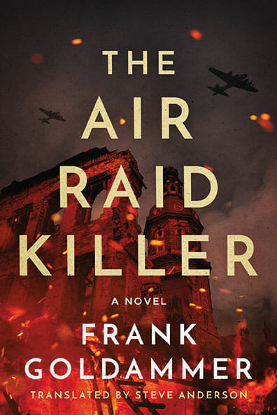
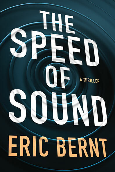
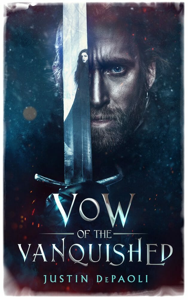
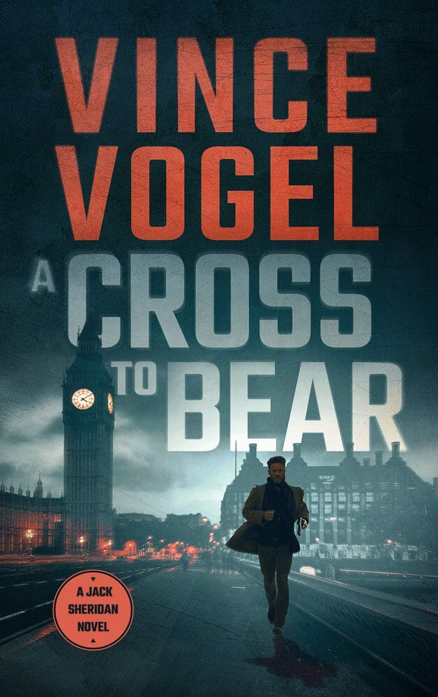
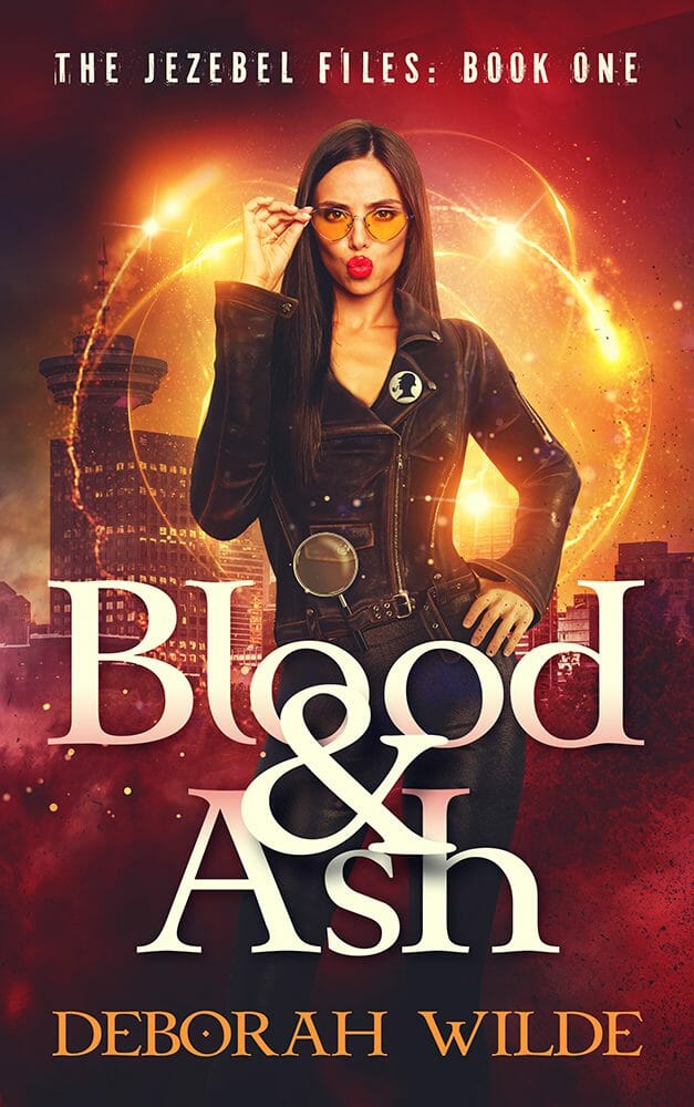
Or look at thrillers. Very recognizable. Dark and gritty, sans serif fonts, with splashes of bright color, usually in the typography but sometimes in the imagery too. That's not a coincidence. Those trends exist because of the visual shorthand that tells a reader the emotion they're likely to feel reading the book.

This is not a random aesthetic choice by a few designers. This is the market telling you what works, and what your cover should look like. This is what your reader is looking for. All you need to do is give it to them.
Where authors go wrong
Where many authors go wrong is in the details. Instead of focusing on fitting in and keeping it simple, they spend too much time on elements that don't actually matter, and not enough on impact. And often those details don't just fail to help. They actively get in the way.
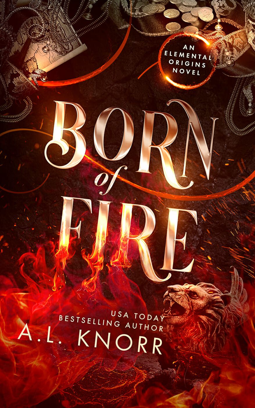
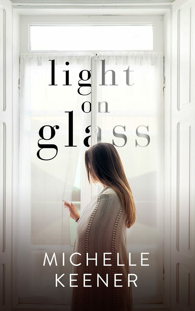
The instinct is understandable. You want to fit it all in. You want to show everyone how amazing the content is. But on a cover, less is more. One strong focal point beats three or four plot elements every time. A reader's eye needs somewhere to land. If you give it too many places to go, it goes nowhere, and the cover gets lost.
Remember those big-budget bestsellers you're comparing your cover to? We design covers for some of those, and the brief is always simple. One focal point. Very clear. The "vibe" is more important than the detail. You're not telling the story on the cover. It's just the door.
The thumbnail test

There's a simple test for this. Take your cover and shrink it down to the size it actually appears on Amazon, roughly the size of a postage stamp on your screen. What can you see? Can you read the title? Is there one focal point?
That thumbnail is the first version of your cover almost every reader will see. It may be the only version they ever see if it's not effective. Not the full-size version you've been agonizing over on your monitor. That tiny image, in a crowded grid of other tiny images, all competing for the same click.
If it doesn't work at that size, it doesn't work.
Don't neglect the typography

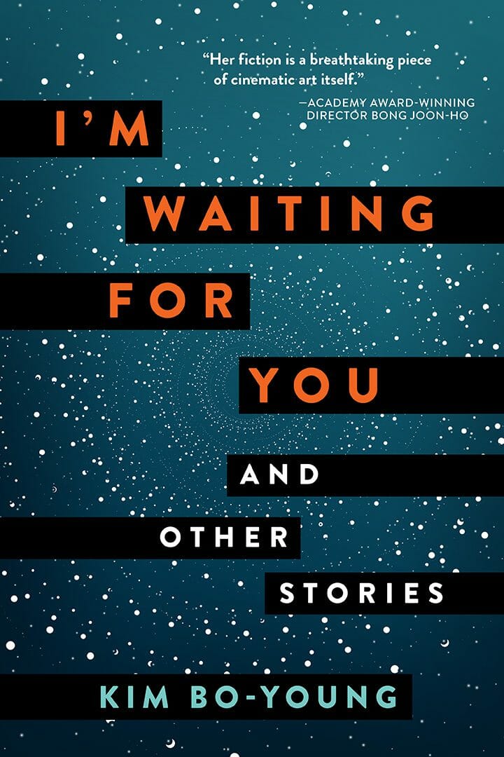
Almost more important than any visual element is the typography. A great image, a great concept, an amazing illustration can all be ruined by a title treatment that doesn't fit. The type isn't separate from the cover. It's part of the cover, and it should always be part of a cohesive design. It's also the one area where you see the biggest difference between big-budget bestsellers and, frankly, amateurs. Titles that are too small, too big, too finicky, too complicated, too generic. All of those turn readers away without them even knowing what it is about the book that doesn't feel right. Don't think of typography as just the text that goes over the image. It's not. It's far more important than that.
While we're on type, there's one specific mistake I see constantly, and it goes against popular advice. I'm hoping to change that: Author names that are far too small. If you want to compete with the bestsellers, you need to look like a bestseller, and none of them have a tiny author name tucked away at the bottom like an afterthought. There's that old line: dress for the job you want, not the job you have. The same applies here. Stand tall. Put your name on your cover like you mean it.
Maybe you don't have name recognition yet, so you think it's not important. But a tiny author name doesn't read as humble. It reads as amateur. Is that the signal you want to send to someone who you expect to pay money for your book?
The only two questions that matter
So ask yourself two questions about your cover:
1. Does it look like it belongs with the bestsellers in your genre? (Seriously, put it in a thumbnail lineup and see), and
2. Does it work at thumbnail size?
That's it.
Not "does it accurately represent my book?" Does it look like it belongs and does it work at thumbnail. If the answer is no, something needs to change (obviously it shouldn't completely fail to represent your book. But focus on impact before accuracy).
Here's the real test. Think about what a reader should be thinking when they see your cover. I'll tell you what it shouldn't be.
It shouldn't be "where is that location, or who are those people?"
It shouldn't be "is that a stock photo, or is it AI?"
It shouldn't even be "wow, what a great illustration."
The only thought that matters is: "that looks like something I want to read."
Not "what a beautiful cover." Not "I love the art style." Those things might be true, and if they are, that's great. But they're a bonus, not the goal. Beauty and effectiveness are not the same thing.
The cover just needs to remind readers of the emotion, of what they loved in other books, and why they'll get that same feeling from yours. So that they think, "This looks like something I want to read."
And then click.

