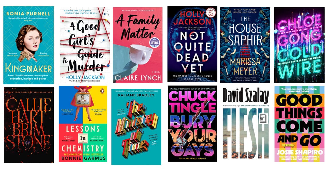
There’s a beauty in telling a story in as few keystrokes as possible. Simmering your prose down to the bare bones serves to make it clearer, more impactful and more exciting. “The road to hell is paved with adverbs,” says Stephen King, wordsmith extraordinaire and man who has somehow lived up to his brazenly immodest surname.
The same can be said for other creative pursuits; like your Italian Nonna always says, you only need a few quality ingredients to make the finest pasta sauce.
The same attitude, too, is best for design. Ideally the cover of your book will use as few brushstrokes as possible, while remaining a reflection of the writing within – strong and succinct. But for self-publishing authors without knowledge of good design, this reflection can have a tendency to turn literal.
In this Ted Talk, lauded book cover designer Chip Kidd – of Jurassic Park fame – tells the story of the genesis of his minimalist style.
“The first day of my graphic design training at Penn State University, the teacher, Lanny Sommese, came into the room. He drew a picture of an apple on the blackboard and wrote the word APPLE underneath. The he said ‘OK. Lesson one. Listen up.’ He covered up the picture, and said ‘You either say this,’ and then covered up the word, ‘or you show this. You don’t do this,’ he said, uncovering both, ‘because this is treating your audience like morons. And they deserve better.’”
The fact that much of your audience may well be morons isn’t the point here. The point is that when it comes to design, spelling out exactly what something is can ruin its beauty, its intrigue and its fun.
Book cover designers know this, but it can be a hard pill to swallow for some writers. Many an author has written a particularly epic passage of their book, be it a kiss in the rain, a fight to the death or a tiger in a spacesuit doing a backflip on the moon, and has said to themselves ‘well that’s the cover sorted.’
But in truth, depicting a scene from your book in all its literal beauty can do more harm than good. For one, it makes the job of the cover designer particularly hard, as the detailed image that has coalesced in your mind is all but impossible to translate onto paper through words. How many times have you watched the film adaptation of a book and thought to yourself ‘why the hell have they chosen that actor? They look nothing like the character!’
It will also inevitably result in a cover that is far too crowded, as you try to capture all of the elements at play. Even the most minimalist representation of a tiger in a spacesuit doing a backflip on the moon will be what designers politely call busy, and impolitely call a pile of steaming garbage.
Finally, it does exactly what Professor Sommese said it would. It treats the audience like idiots. It says ‘the only way I could convey this story to you is to spell it out in BOLD, CAPITALISED LETTERS because I don’t think you’re capable of understanding anything else.’
The Apple logo isn’t a computer. The Nike logo isn’t a pair of sneakers. The Bank of America logo isn’t a big ol’ pile of cash. These companies have chosen a representation of their brand that doesn’t say ‘this is what we do’, but does to some degree say ‘this is who we are and what we’re about’.
And that’s exactly what good design, be it for a corporate logo or the cover of your book, is all about. It should make subtle suggestions and push its audience in the right direction, rather than yelling in their ears. It should steer itself away from the literal, to a more restrained and figurative form of representation.
It should, where possible, avoid pictures of moon-based backflipping tigers – even if the title of your book is An Idiot Tiger’s Guide To Doing Backflips In A Spacesuit On The Moon.


